How to Choose Your Website Colors and Layout

Jun 22, 2022

When designing a website, almost anyone will wonder how to create the most appealing experience for their visitors. A major component of a site visitor’s experience is unsurprisingly based on the design of a site, where a visitor’s first impressions of a site are solidified between 0.2 to 2.6 seconds of first arriving on the site and are 94% based on the website’s design. The short timeframe and significance of a site’s design in influencing how visitors think of a website, and thus whether they’ll spend any time interacting with and consuming your content, makes the question of your site’s design something you should never overlook.

For this article, we’ll specifically be discussing the efficient usage and importance of color schemes when designing a pleasing website for visitors. For a discussion on your website’s navigation streamlining and ease of use, take a look at this article of mine where we go over 5 simple and useful tips to designing your website. For tips on website layouts, content, and more, take a look at this article where we discuss the importance of website content layouts and expand our discussion to include how often you should post and what you should focus on when running a blog.

Some might wonder what would be too complex or difficult to pull off, while others might settle for a very simple design and leave their website at that. In truth, designing your website’s color scheme isn’t a completely surface level task that can be done well when approached without planning. The good news is, it’s also not as complex as some people think it is, and helpful tips and tricks can help you a lot with picking your website colors.

Make Pleasing First Impressions

There are several ways that your usage of colors in your website layout can make strong positive first impressions on your website visitors.

The Importance of White Space

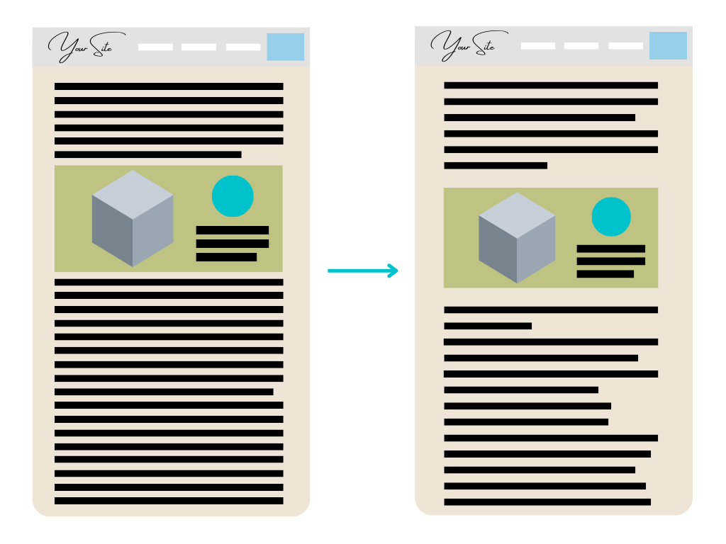
I’ll be using the term “white space” to refer to any open space on a website’s page that’s meant to space out content and contribute to the overall design of the site. Even though the term says “white”, white space as I’m referring to it doesn’t have to be the color white, and can easily be other colors like creams, shades of gray, or black, depending on any website’s individual design. Every website needs some white space to give its content breathing room, as demonstrated in the image below. A little more white space can make a lot of difference in terms of how visitors see your website.

Website Layout White Space Comparison
By subtly increasing the side margins’ widths on the page, slightly increasing the distance between lines of text and images, and introducing more organic spacing in the text itself, we can easily increase the white space of a page. This lets us improve the readability and openness that websites strive to give their visitors. 
We’ve all gotten used to a lot of white space on any website you visit, from ecommerce sites to corporate home pages. Sometimes, we might not even notice how important it is until we’re suddenly given little to no white space. White space contributes a lot to the readability and feeling of approachableness that websites strive to give their visitors. White space and the simple colors it gives to a website brings a neutral and familiar feeling to visitors. Paired with thoughtful spacing of content, it can make your site visitors feel more pleasant about staying on your site and continuing to engage with your content.

Balance Your Colors

When you introduce different colors onto your website’s design as part of a color scheme, you’re aiming to create a more visually interesting design for your visitors. This is why it’s important to remember a key rule: the goal of color schemes isn’t to overwhelm white space, but to compliment it and enhance it. Your goal isn’t to replace the majority of the white or otherwise light colors on your website, as you might be tempted to do. Instead, you should look to add colors to a base design and color scheme of your website, however simple it may have started out, to create a more pleasant and memorable look for your site.

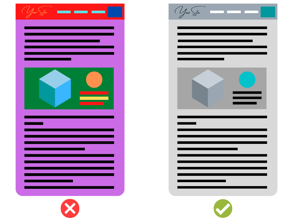
From my experience, I’d advise you to pick one color, and around this color, you center any other color design decisions you make. Don’t make things too colorful, as that will feel overwhelming and unpleasant to your site visitors. At the same time, don’t go overboard and get rid of all the simple or gentle tones of your website’s color themes! Make sure to balance out your colors and designs so that your page isn’t overly noisy in terms of its visuals, while still maintaining a unique and pleasant usage of colors and open spaces that are basic simple colors.

Website Colors Color Usage Comparison
If your website uses an alternative base color for the majority of your site’s design instead of white, like cream or a shade of gray, consider the tips I’ve just given in this section and apply them to your chosen color.

Use Colors Consistently

A largely unspoken but integral aspect to a website’s visual appeal is the consistent usage of colors for different elements of a website’s layout. Within a color scheme, you’ll be selecting different colors to use for the colors of your main body text, the widgets and buttons around your different pages, and any other elements of your website. In doing so, you might be tempted to introduce some different and eye-catching colors into your website design. While this is a foundationally good desire to have so that your website can be more appealing to visitors, there’s an important ground rule to remember: always use colors consistently for the same and different elements of your website.

Consistent color usage is key to your visitors understanding how to navigate your website and being pleased by your visual consistency, and creating an overall professional user experience across your pages. They’ll come to recognize, for example, that links in your text are blue, buttons to the side of pages are green, and your header is cream colored. Your visitors would then be very confused and put off by your website design if you suddenly changed your color scheme on other pages to have links in your text as green, buttons to the side of pages as pink, and your header as gray. Imagine yourself encountering such a color scheme change on a website you’re visiting: wouldn’t you feel confused and as if the website is of lower quality?

Abrupt color scheme changes would displease your visitors due to the sudden change to the visual and navigational clarity that they’d originally been adapting to, and give your users the impression that your website is not of high quality, which might seriously impact whether your visitors stay on your pages or engage in your content. You would never see abrupt color inconsistencies of website elements on proper websites, from fast food chain pages to established furniture warehouse websites, because of the professionalism that these websites maintain. You should do the same and aim to give your visitors as great a sense of quality and professionalism as possible through the website that they’ll know of you through. When you come up with a way to use your color scheme on recurring elements of your site, stick with it and stay consistent across the different pages of your website.

Connect Colors to What You Do

A great way to come up with standout and meaningful color schemes for your website is to connect it to what you or your website do.

What Does Your Website Represent?

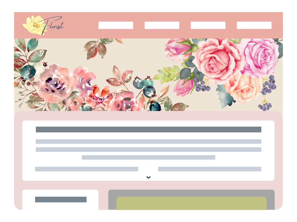
Think about what you offer as a website and/or business, who your business is appealing to, and connect your color schemes to your answers to these prompts. If you’re a florist, you can base your color scheme off of your best-selling or personal favorite flowers to add a personal touch and flare of color to what potential clients see when they click onto your website. Who doesn’t like the elegant and uplifting colors of flowers? If you’re an online marketing consultant and advisor, you likely have a logo for your services that extends to your website, so you could use one of your logo’s colors as the main color that compliments your site’s white space, or you could choose colors that compliment your logo’s colors, so that your website feels distinctly original and representative of you.
Website Colors Color Usage: Florist
Website Colors Color Usage: Consulting

Cohesive Concepts

By picking the right colors, you can give your visitors a feeling that connects to what your website offers and who you’re aiming to appeal to. As a florist, you might be trying to appeal to people who want to express their emotions through gifts of flowers, so go with softer palettes of pastels and warm tones that compliment the foundational white colors of your website. This will give your visitors a comfortable feeling that will compliment their needs. On the other hand, as an online marketing consultant and advisor, you want potential clients on your website to understand that your business is attuned for a modern outlook on the world of marketing, so you can choose to use sleek and tempered colors like cool blue tones and metallic shades paired with simple white space colors like white or shades of gray.

Cohesiveness of colors with your branding can make a strong impression on your website visitors. Put some thought into how color schemes can compliment what your website stands for. It can help you really connect with or sway potential clients to give your business the support and love it deserves!

Look For Inspiration

Even though website color schemes can often be based on aspects of the website like its business or its logo, it doesn’t always have to be this way. This might especially be the case if you don’t have any specific colors for your logo, or if you’re just starting out your website and don’t have any established branding just yet. In cases like this, you’ll be looking for ideas and inspiration for how to bring your website to life with color.

Your Own Inspiration

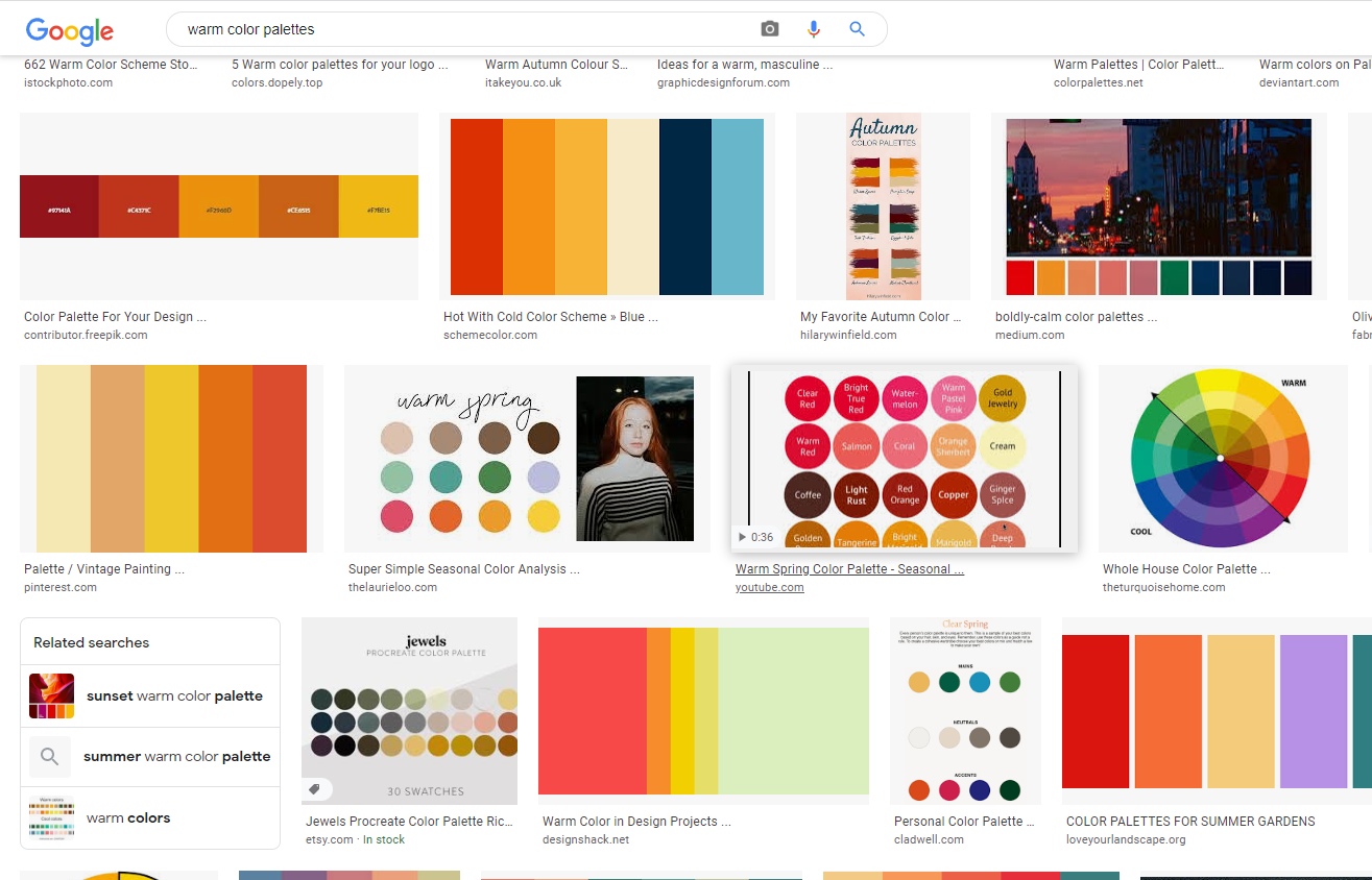
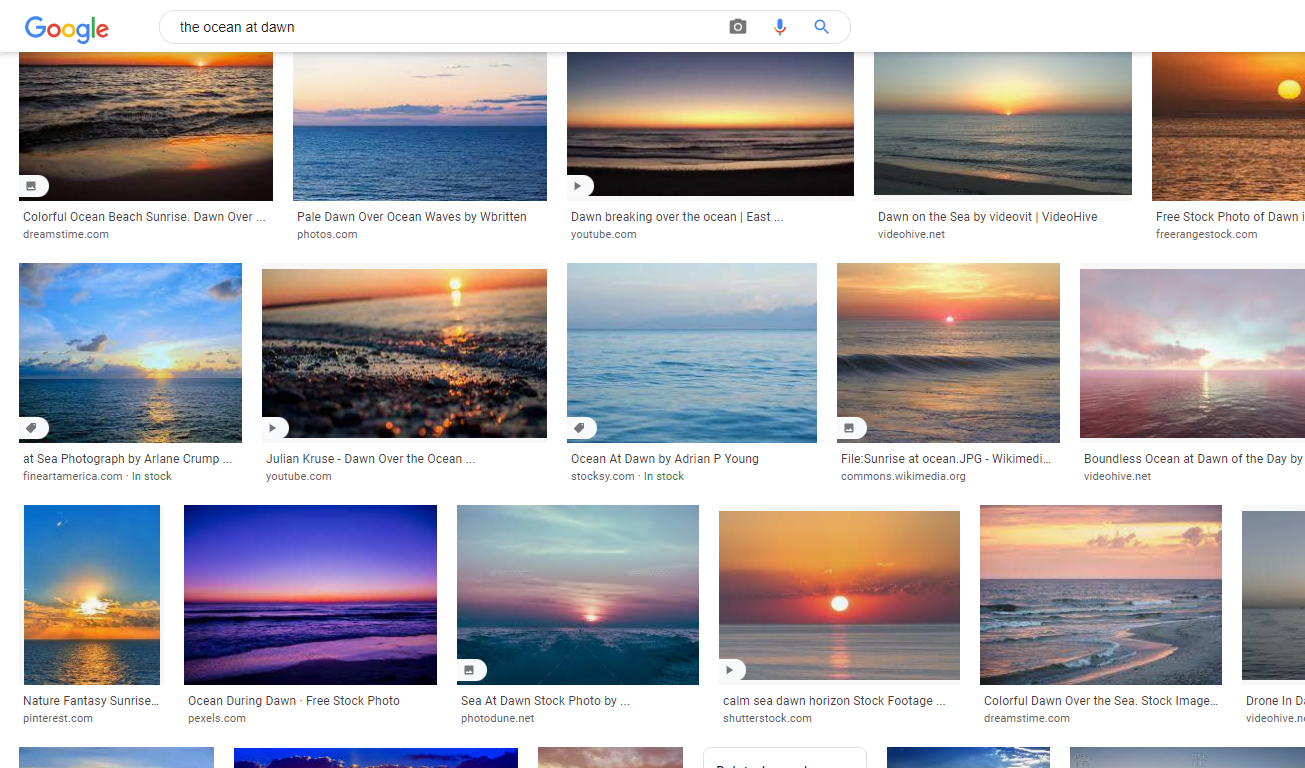
Your website’s color scheme could be based on something that you personally take inspiration from and want to incorporate into your site’s color scheme. Inspiration can be taken from something as simple as a Google search. One of the simplest ways to do so is to search for images on Google based on what you’re looking for. Look for color palettes, color sets grouped by tone or usage, mosaics, and more that people have put together online to find inspiration from. From here, simply being open minded about what results catch your eye should find you solid inspiration to work off of. For a different approach, you could Google different objects, concepts, locations, environments, and more to spark your own ideas for how to introduce intriguing colors onto your site’s design. The only limit to finding inspiration is your own imagination.
Website Colors Color Usage Google Inspiration
Website Colors Color Usage Google Ocean Dawn
Beautiful color palettes, and the inspiration that comes from them, are just a Google search away.

The World Around You

Look around you in different aspects of your life to spark inspiration. Maybe you live nearby a park known for its beautiful flowers, and you could take their colors to make them a main or complimentary color for your site’s overall color scheme. You could even coordinate your website’s color scheme with the colors of fixtures or decoration in your business’s office, which would be an extra touch of coordination and attention to detail that clients might notice if they visit both your site and a physical location you operate.
Website Colors Color Usage Google Ocean Dawn
For example, if your office fixtures feature a sunny yellow like the chairs shown here, you could incorporate this yellow into something like the header and footer of your website’s design.
As long as the colors are overall cohesive and don’t detract from your website’s overall function and appeal, any color schemes are worth a try!

Premade Color Schemes

In cases where your creativity might be failing you, or you simply want to save yourself the effort of selecting and coordinating colors for your website’s design, premade color schemes are the choice for you.

Quick and Accessible

A solution for your website’s color scheme that will always be reliable is to use premade color schemes. You’ll find these readily available in many website design or building tools that you use, or you can easily Google them and find their hex codes so that you can manually apply them to your site’s design in little to no time. Whether you find your own color choices turning out suboptimal, or you’re not the most confident in your taste for website color choices, or any other reason in between, you can never go wrong with premade or premade color schemes.

Harmonized Colors

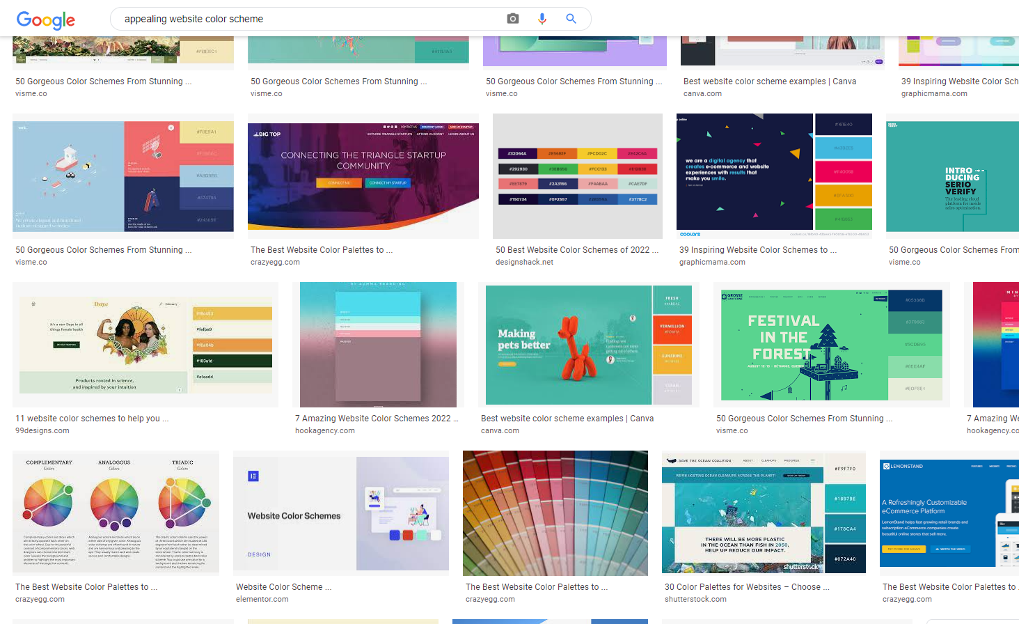
Premade color schemes typically consist of several colors chosen and used together on websites for a near-guaranteed harmonized color scheme that’s pleasing to the eye. Enter “appealing website color schemes” on Google, for example, to get a wide variety of results that demonstrate different color schemes implemented into different types of websites for a wide range of results. You’ll also find premade color schemes on different online site design and building services. Whether you choose to use only one, some, or all of a premade color scheme’s colors is entirely up to you and what you think your website needs. These premade color schemes are almost always designed and chosen by people with real passion for design and tangible industry experience, and are thus backed by knowledge and intention in their color choices. Don’t shy away from using premade color themes to put yourself at ease and make sure your site is presentable.

Website Colors Color Inspiration Google
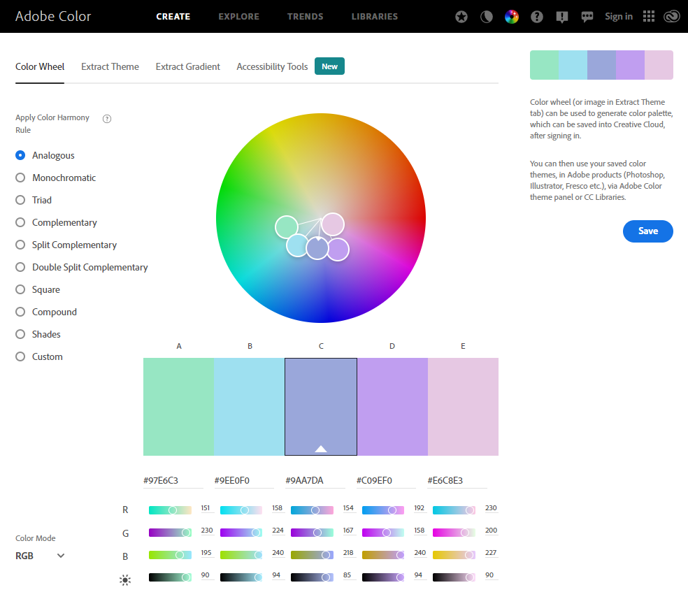
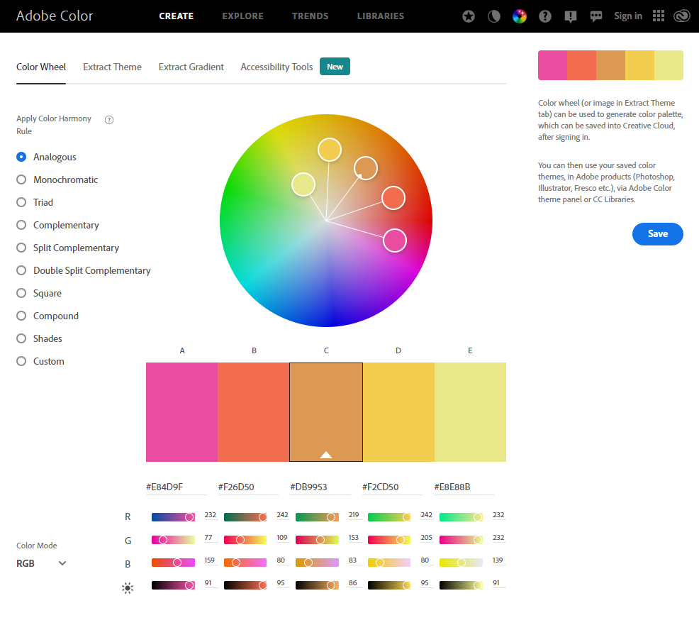
A great source of color palettes that are harmonized and immediately ready for you to use, while also giving you the individual freedom to customize what colors you’re looking to use on your site, is the Adobe Color Wheel website. Adobe has used color theory for this service’s color selection so that no matter what colors you select, you’ll still have a harmonic balance of colors. The way to use this service is shockingly simple, which is great news for anyone who plans to put it to use. Simply move the color selection circles around a color wheel with your mouse to discover unique color palettes that offer you great inspiration and potential. Select from a variety of Color Harmony Rules that preset and lock in the contrasts and differences between the various colors generated from the parameters for color selection. The possibilities are infinite when using this site for any of your color-selection needs.

Website Colors Color Wheel Adobe
Simply by dragging the mouse a bit around this color wheel, entirely new and unique color schemes can be created. Further customization can be achieved by changing the settings you can see around the page and getting creative with how you select colors around the color wheel.

Premade Color Schemes and Website Building

Depending on what service or platform you’re using to create your website, you might have many premade color schemes to choose from, a very limited range of selections, or none at all. You might prefer to have many premade color schemes to choose from, or you might choose to have no premade color schemes in exchange for complete freedom to design your site however you want.

Those that fall into the category of wanting many included color schemes to choose from will probably want to look for website building and design services that include a wide range of preset templates and design features to choose from and use hassle-free. For this need, I would recommend using website.com’s website builder, which is free to use but can also be bundled with a variety of website hosting plans. When I first started using their services, I found myself pleasantly surprised by their hundreds of preset website designs with preset color schemes available for me to use, so I never had to worry about whether my website’s design would be appealing to visitors. In my experience, it’s great for beginners and experienced website creators alike that are looking for a streamlined drag-and-drop website building experience, and it gives you a solid starting point to design a great website.

WordPress may offer more overall freedom in designing your website, but it comes at the cost of a lot more learning, experimentation, time, and effort invested into learning how to design your desired site. This is why I’d recommend website.com’s website builder to people who want a more simplified and condensed website building process. I’d also recommend their website builder to anyone who might not be entirely confident in their website building abilities just yet, but still wants to create a presentable professional-looking site to make the strongest impression possible on their site visitors and clients.

Staying Original

A few concerns can be raised about using premade color schemes, but luckily, they have straightforward solutions. One worry is that other sites might use the same premade color schemes as you, which would confuse visitors about whether your site is affiliated with sites it’s not actually affiliated with. A solution to this concern is to use most or some of the premade color scheme’s colors, but to add in a few complimentary colors of your own choosing to create variety and set your colors apart from the premade options you’ve used. Another worry is that your visitors might, through one way or another, recognize your color scheme as being a premade selection and as a result think less of your site for this. The solution to this is to again keep some of the colors in the color scheme the same, but to set yourself apart by introducing your own colors into your overall design.

Closing Thoughts

Ultimately, a color scheme is key to making your website more unique and stand out to visitors. Make sure to be thoughtful with your white space usage on your site, and choose colors for your site that compliment but don’t overwhelm your site’s design or your visitors. Inspiration for color schemes can be found everywhere in life, from your website’s logo to the beauty of the world around you. Of course, the internet with its billions of users and websites is bound to offer you the inspiration and foundations for your color schemes should you find yourself a little short on ideas. With a great color scheme for your site, you’ll be adding memorability and uniqueness to your already-great website!

After reading this article about color usage on your website, some of you might be wondering about another aspect of website design: how to select the fonts you use around your site. I’ve got you covered! You can read about the basics of thinking about and choosing website fonts, and you can also read about important factors to consider when choosing fonts.