Why Do You Need a Contact Page?
Step-By-Step Guide for Creating a Contact Page
Have you ever had this experience where you want to reach out to a website owner but you just can’t? Simply because you can’t find any contact information on the website, not even a contact form. Well, that’s me.
When a person clicks onto a website, they will most likely first come across the homepage. If they are interested and want to know more about the person or company, the next one will be the “About Me” page. And if they have decided to take a step further and connect with you, they will start to look for some kind of contact information.
At its core, a Contact Us page is a way to convert your visitors into leads and customers. It is a hub where people can get in touch with you or your business via the different channels that you’ve offered. A website without any contact information is a waste of resources and effort.
What Do You Need to Have in the Contact Us Section
You can customize and add different elements to your contact page based on your needs. However, a typical contact page includes:
Contact Form
A contact form guides your visitors to present their inquiries and comments to you. It helps to gather the information within your system, streamlining the process for organizing and prioritizing so you can respond quicker. Your contact form should be short, straightforward, and easy to follow.
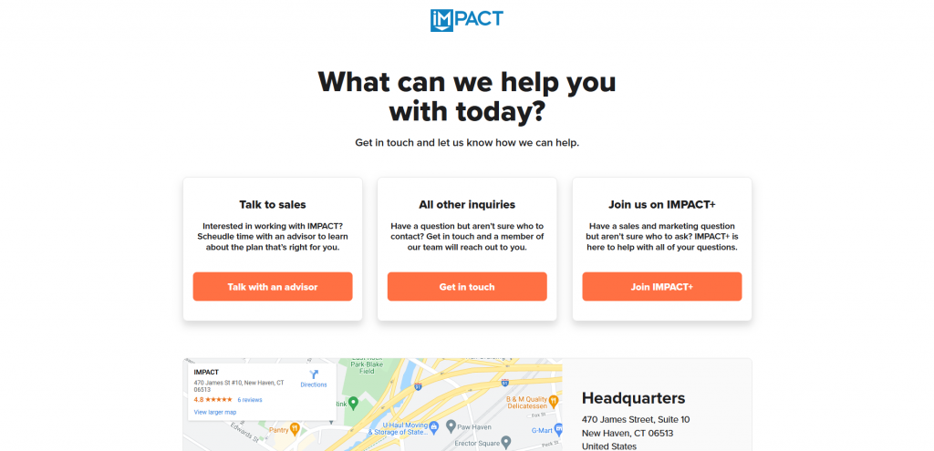
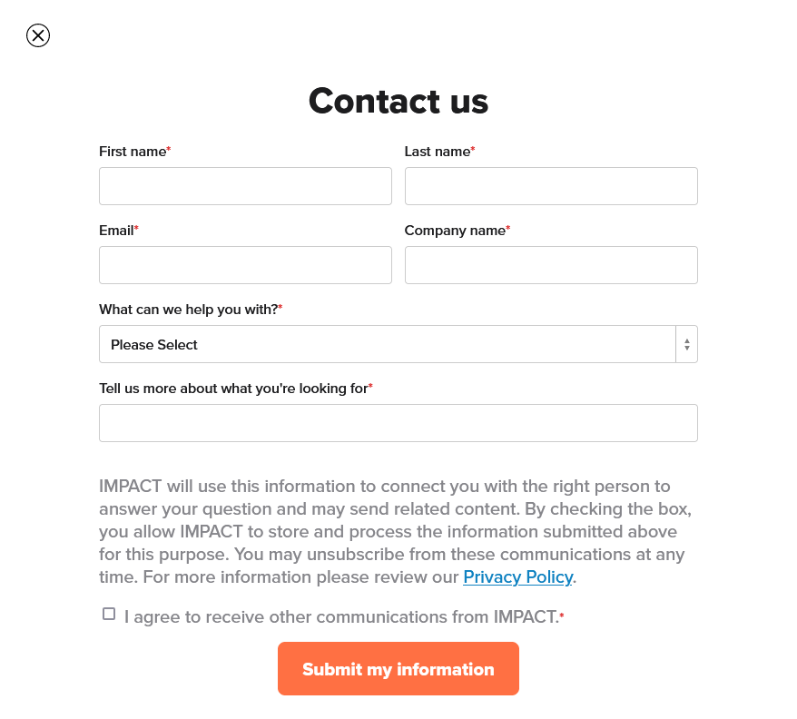
Rather than needing to explain everything from zero, IMPACT’s contact form “What can we help you with?” option helps users to skip the first step and jump straight to the issue. And for website owners, it helps to organize your incoming messages easily.
When creating the contact form, try getting rid of all the unnecessary fields by asking yourself “why do I need to give this piece of information?” If you can answer it, sure include it. You can also set certain fields as mandatory (“Required Fields”), meaning the visitor won’t be able to submit the web form without answering these questions. By making it mandatory, you can collect vital information such as name and contact information. Imagine receiving an inquiry without contact information, it is near to impossible for you to engage with this request. And for the visitor, without knowing the actual problem, you are unintentionally giving a bad impression by not replying to them.
Multiple ways of contact
While a contact form can handle the majority of the connection/inquiry requests, it is always good to also put down your phone and e-mail address. Say if a person wants to connect and collaborate on a project together, he or she might also want to send over some documents as a reference. A common contact form usually would not have this option for people to include any attachments, hence they would most likely opt for connecting via email.
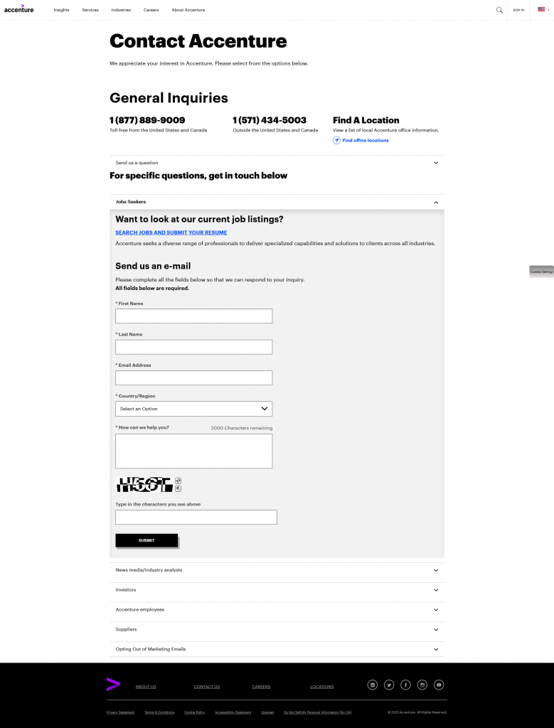
Not only did Accenture have multiple ways of contact, but they have also included dedicated contact forms and contact details for specific groups.
People are different and all got our personal preferences when choosing a communication medium. Some might prefer filling up a form, some prefer personalizing their message and providing more content using an email, or some just want to quickly talk through a phone. By offering options, you’re also showing your potential customers that you are flexible and welcome different kinds of people to connect however they want to and feel most comfortable with.
Physical address (if you have a physical location)
If you have a physical store, other than just writing down your address, it is always good to provide an actual map of your location. For one, you are saving your potential customers’ time to double-check and see if they’ve got the correct address. It is always good to embed a Google map so all people need to do is to click onto the map and immediately bring them to the Google Map app itself, rather than having to copy and paste manually from your website. Imagine if someone is driving to your place, a simple tab can do wonders!
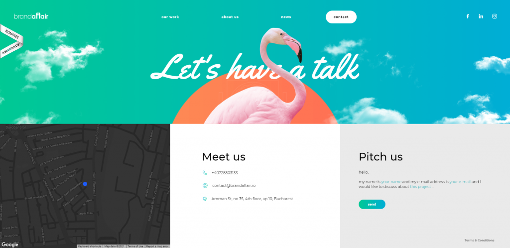
Brandaffair embedded the Google Map on their Contact Us page, you can zoom in and out of the map on their page, but also jump to the Google Map page by clicking on the address under the Meet us column.
Which Platform Should You Use?
There are mainly two types of systems for you to choose from when it comes to creating a website. Content Management Systems (CMS) like WordPress offer more flexibility in customization, but also require more technical expertise. Or Website Builders like Squarespace, Website.com, Wix, which are easy to use, don’t require much coding knowledge, but relatively less flexibility compared to WordPress.
If you are a beginner at building a website and don’t know how to code, I would strongly suggest opting for website builders instead. And among all the different options, I will go for Website.com, a simple website builder where you can just drag and drop elements to wherever you want. The majority of their website features are free to use, and you have the option to upgrade your plan to a paid one as your needs grow.
How to Create a Contact Us Page
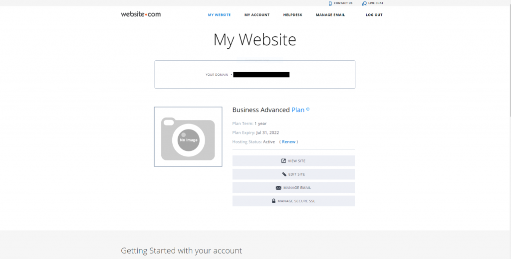
The very first thing you need to do is log in to your Website.com account.
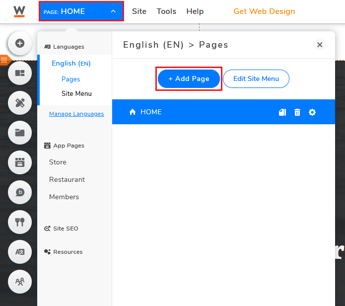
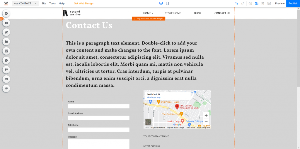
Get to your website builder and click Page, and select Add Page.
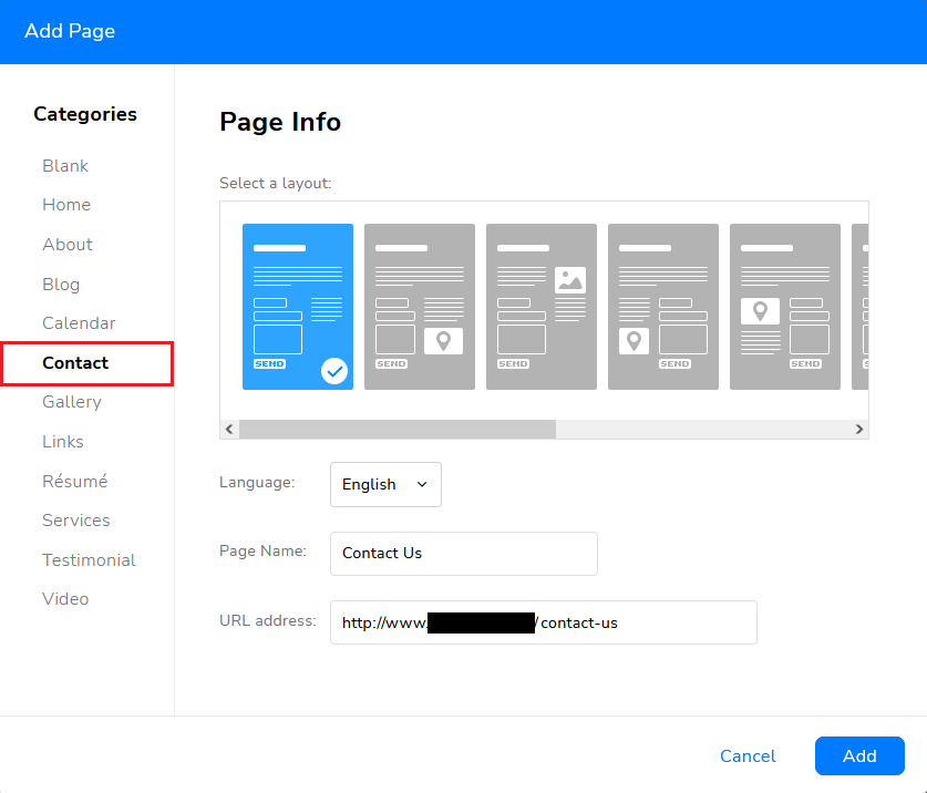
Select Contact Us and choose a layout that you prefer.
You can also create a brand new contact page from scratch by selecting Blank, but if you don’t have any idea how you would want your Contact Us page to look like, I’d always suggest going for the template options.
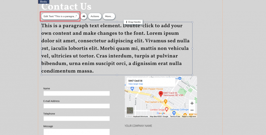
Click Edit Text to customize placeholder text cards
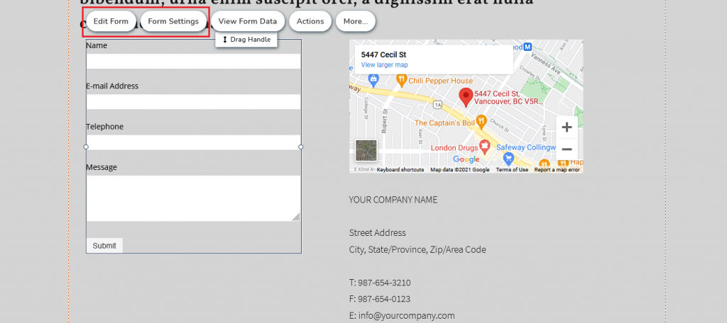
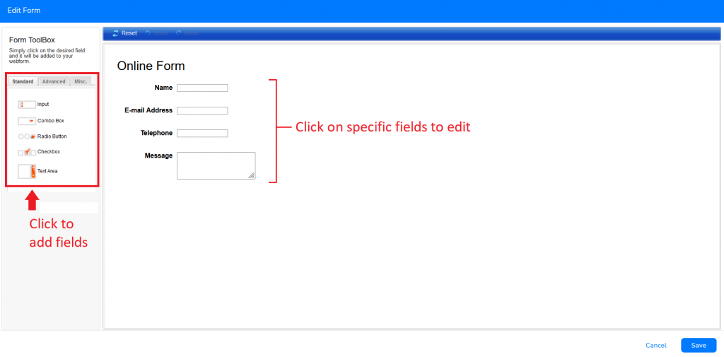
If you want to edit the content of the web form, choose Edit Form.
Feel free to add/delete fields and further customize them according to your needs.
If you want to edit the settings of the web form (Customizing confirmation messages, submission e-mail notification, redirection URL after submission, etc.), choose Form Settings.
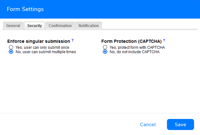
Under Security, you can also activate Form Protection (CAPTCHA) to prevent form spam submission. CAPTCHA is the acronym for Completely Automated Public Turing test to tell Computers and Humans Apart, it is a kind of challenge-response test used to determine whether the user is a human or a bot. Original CAPTCHA tests started off using generated images of random and distorted characters, simply because humans are better at reading distorted images than computers. But as times go by with new software and the rise of artificial intelligence being able to crack CAPTCHAs at 99.8% accuracy, modern days tests have evolved to answering arithmetic questions—involving users to solve simple mathematical questions, to tests involving selecting images according to a given clue.
Website.com’s CAPTCHAs prevent bots from automatically submitting countless entries through web forms.
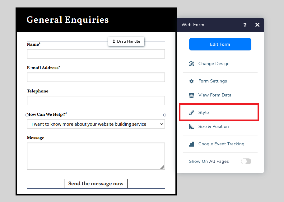
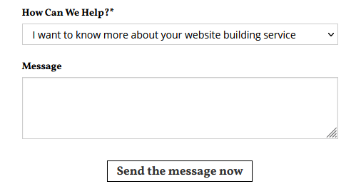
If you wish to customize and personalize your submission button (for instance, I’ve changed mine to “Send the message now”), click on your form, select More, then Style.
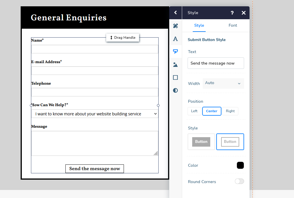
Select the third option Submit Button. You can customize the text shown on your button, the font, and the design of your buttons here. I will further explain the perks of customizing the submit button later on in this article.
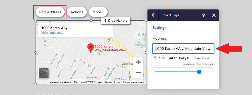
Next, the embedded map on your contact us page. Click Edit Address to customize the address, once you’ve inputted a new address, Google Map will automatically update the embedded map on the web page.
If you want to add additional content to your Contact Us page, simply click Add Elements or Add Cards.
Click here to know more about adding content to your web page.
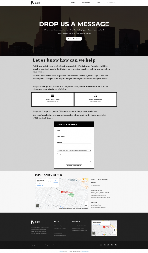
Here’s an example of a Contact Us customized for a website building company.
Customize For Mobile
An increasing number of people are surfing the web on their mobile devices. Your potential customers could potentially be coming across your website when traveling, queuing to pay at a supermarket, or even at a restaurant while waiting for their food to arrive. They find your business interesting and wanted to contact you, but simply could not do so as none of your Contact Form elements was optimized for a small screen. What next? Likely they will just give up and move on to another company. And that’s how you might lose a potential customer.
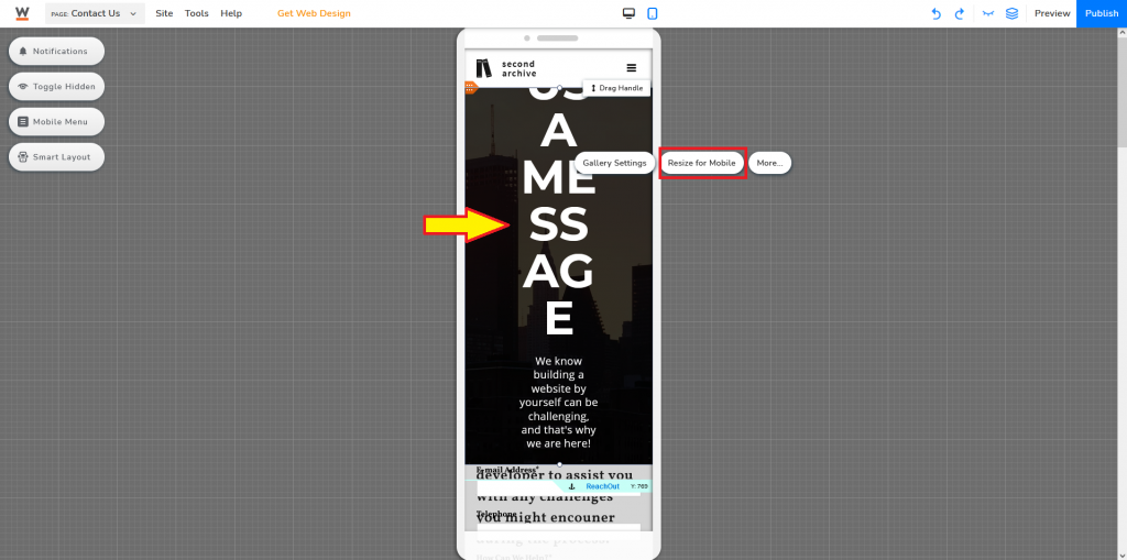
To optimize it for mobile, click the mobile icon at the top middle area of your website editor.
At this point, your elements might not immediately be optimized for mobile. You would have to click on different elements and select Resize for Mobile, or optimize manually.
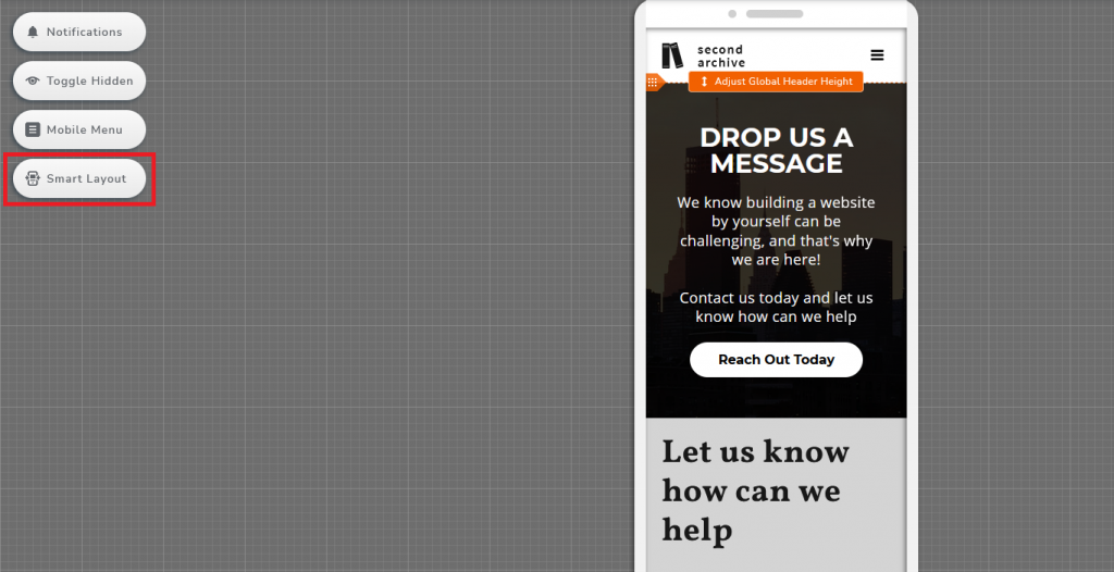
Alternatively, you can also try to activate Smart Layout.
How to Utilize Your Contact Page?
Catchy Call-To-Action (CTA)
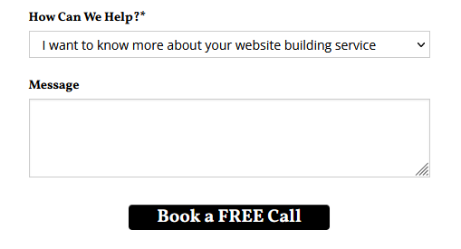
A Contact Us page, the name itself is already a call to action. But it never hurts to give more instruction to your visitors, guide them to do what you want them to do—contact you! I have previously shown you how to customize the web form submit button, this time around I am focusing on not only making it a little bit different from the system default version, but to create one that incentivizes people to take action. If you think “Send the message now” is a bit boring, why not change it to “Book a FREE Call” and change the design so it stands out!
Another potential way to engage with your visitors is to ask them questions and incentivize them to reach out to you.
Add direction
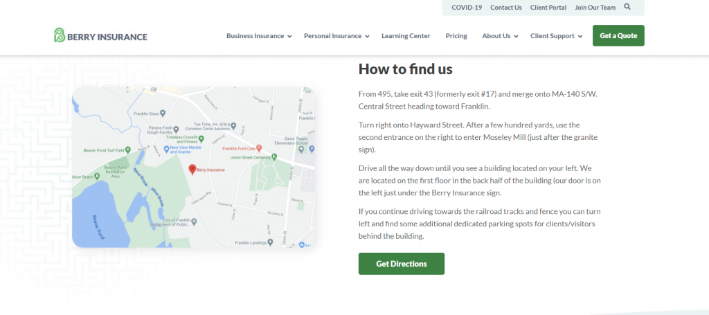
People are coming from all directions and they might not know much about the area you are in. In addition to embedding a map, providing simple directions for people to follow will make your business stand out. You are putting yourself in your customer’s shoes to understand the confusion when finding a place, particularly in a new area.
Berry Insurance provides detailed driving instructions on their Contact Us page
Make it attractive
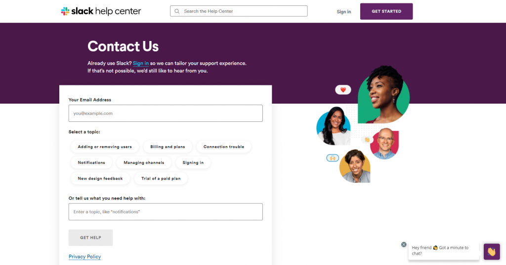
People and companies often put contact pages at the bottom of their priority list, did not spend much effort and thoughts on the design of the page, and ended up just tossing a very generic and standard templated page. You are telling people to contact you, but how would people feel when looking at “just another contact us page”? Just because it is a standard to have a contact us page, that doesn’t mean that the content and design should be standard. Add graphics, small icons, contrasting colors to make certain elements stand out. If you are delivering a certain tone on your other pages, do the same with this one.
If you have ever used Slack before, you know purple is their main color. And it being a messaging app, having human faces and emojis on their page goes in line with their main service—a communication tool “bringing people together to work as one unified team”.
Having a contact us page won’t necessarily make people contact you. Rather, tell your visitors why should they contact you, what can you provide, and how can you help them. Give them a reason to contact you. Customize the messages on your contact page and make them personal, it is more likely your visitors will pay more attention and engage with you by crafting your messages.
If your message is attractive, you might be able to achieve a higher conversion rate!
