How to Choose Your Website Fonts

Jul 6, 2022

Choosing fonts for websites can prove to be a bit of a challenge for many people regardless of how experienced they are with creating and designing website pages. It’s not just the colors and design of your website that give visitors different impressions, but the font of your text too. Choosing fonts has a lot of influence over how your website presents itself to your visitors, changing the look and feeling of a site’s first impression. Picking the right fonts has the power to elevate your website to make positive, strong, and memorable first impressions on your visitors. Picking the wrong fonts, however, can bring the rest of your website down and make your website, no matter how well written your content is and how well designed your color schemes are, unappealing and thus unsuccessful.

In this article, I’ll be talking about important considerations and priorities you should keep in mind when looking for and selecting fonts you plan to use on your website. I’ll answer common questions, explain the reasoning behind the decisions you should make, and provide you with helpful resources that’ll help you find the font or fonts that best fit your needs. 

In this article, we’ll be talking about:

Considerations For Choosing Fonts

There are several key considerations to have before going into selecting fonts, which can greatly alter the kind of font you’re looking to use on your site. Ask yourself, what do you need out of your font? Your considerations should be based on your individual circumstances, since your circumstances are what determine the functionality of your fonts from readers’ perspective.

Font Accessibility

When selecting fonts, you want them to be immediately readable and legible without issue, so that your readers can have as smooth a reading experience as possible. Additionally, you want fonts to be web-safe, meaning that they work across all types of browsers and devices, so that you can reach the widest audience and communicate your content with efficiency and accessibility. The spacing between letters, smoothless of the text, and size of the text are all considerations you should make for your readers to have the best possible reading experience with your content. Additionally, avoid all uppercase fonts, especially for larger bodies of writing, to avoid straining your readers’ eyes.

However, it’s important to note that if you want to use the exact same font from Photoshop on your website as the font of your titles or headings, for example, this might not work, and it might not be possible to have text on your site typed out and displayed in the Photoshop-specific font. This is because many fonts are only visible and usable in Photoshop, and these fonts might not be compatible with being used and displayed by the website builder that you use, or devices running on certain operating systems won’t be able to properly display your chosen fonts. These two potential sources of problems represent accessibility issues for your visitors. Even if these fonts are able to be imported from Adobe’s services to other locations like your website, use of many Adobe fonts are locked behind subscription plans, which represents a new monthly expense that you’ll be reliant on paying just for your site to appear the way you want it to. These reasons are why it’s important to consider the overall accessibility that you and your visitors have to fonts that you use on your site.

Feeling and Mood

Make your fonts match the feeling or mood of your content, and make sure this feeling or mood aligns with how you want readers to feel when reading your content. Depending on the fonts you use, readers can get the sense that your content is, for example, minimalist, or refined, or elegant, or any other feeling you could aim for.
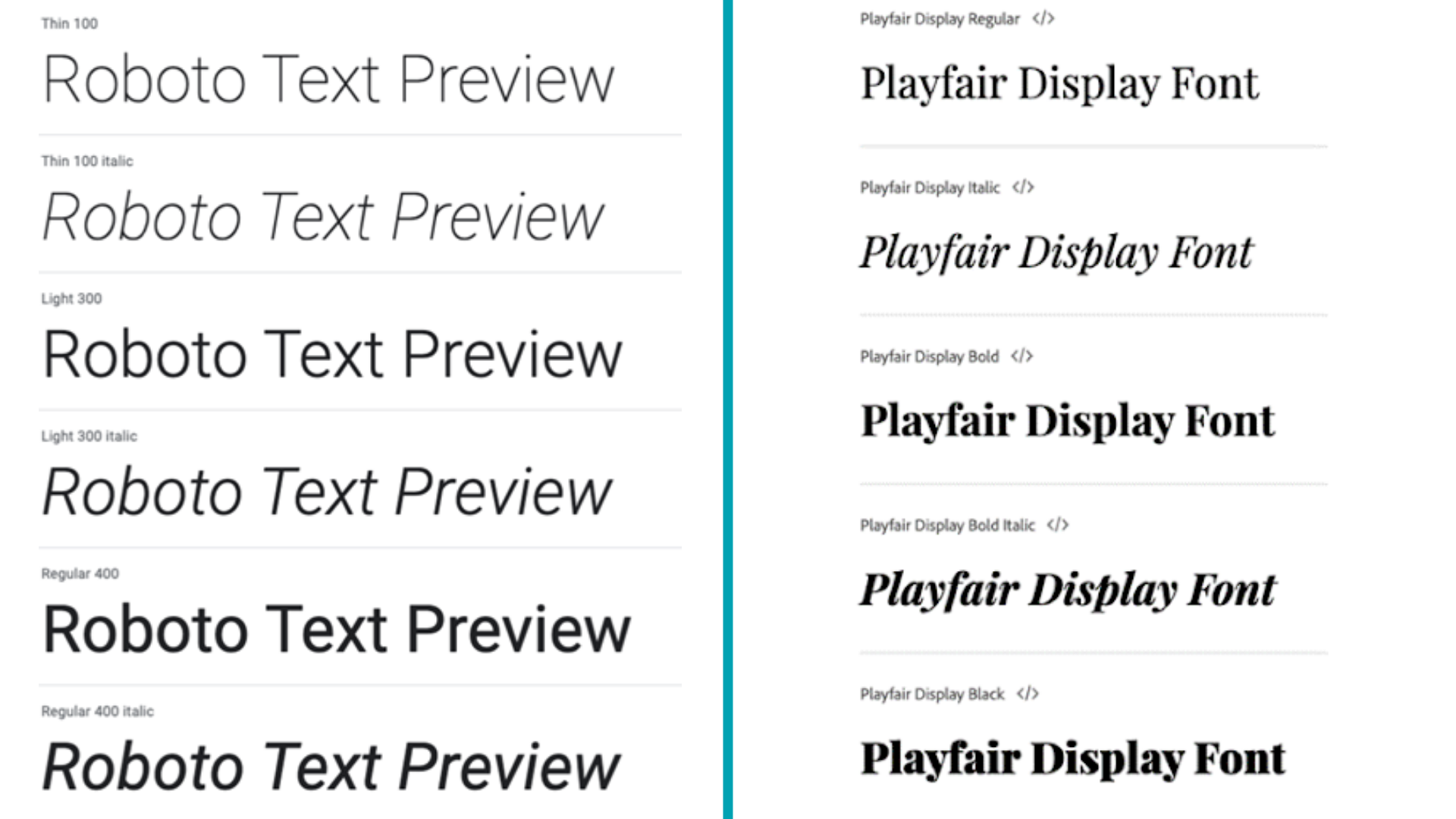
Website font comparison Roboto vs Playfair Display
As an example, Roboto and Playfair Display give off contrasting feelings. Roboto is described as being friendly and youthful yet still professional, while Playfair Display is identified to be more elegant and traditional. Consider what sort of feeling you want readers to get from your content when deciding what font to use for your site.

Simplicity of Choices

Website designs featuring a single type of font are ideal, for simplicity and consistency’s sake. At most, 2 different fonts may be used, but even with 2 different fonts, they should be visually similar, mesh well with each other, and give readers the same cohesive feeling. This is so that readers aren’t overwhelmed by unsynchronized feelings given off by contrasting fonts. Of course, simplicity is key to font selection, so finding a font that gives you a range of weights, styles, and variants to choose from is ideal, and can save you a lot of hassle in the future.

Variety Within Fonts

Some fonts aren’t just fonts, but are directly connected to an entire family of fonts. Families of fonts are fonts that are of the same type but feature different aspects such as varying line thickness, varying letter spacing, varying letter slanting, and more. Picking fonts that belong to font families is great for long-term use, because you can introduce a wide range of variety into different bodies of text depending on, for example, how thick letters are. You can enjoy both visual cohesiveness and interesting aesthetic variety when using fonts belonging to font families together.
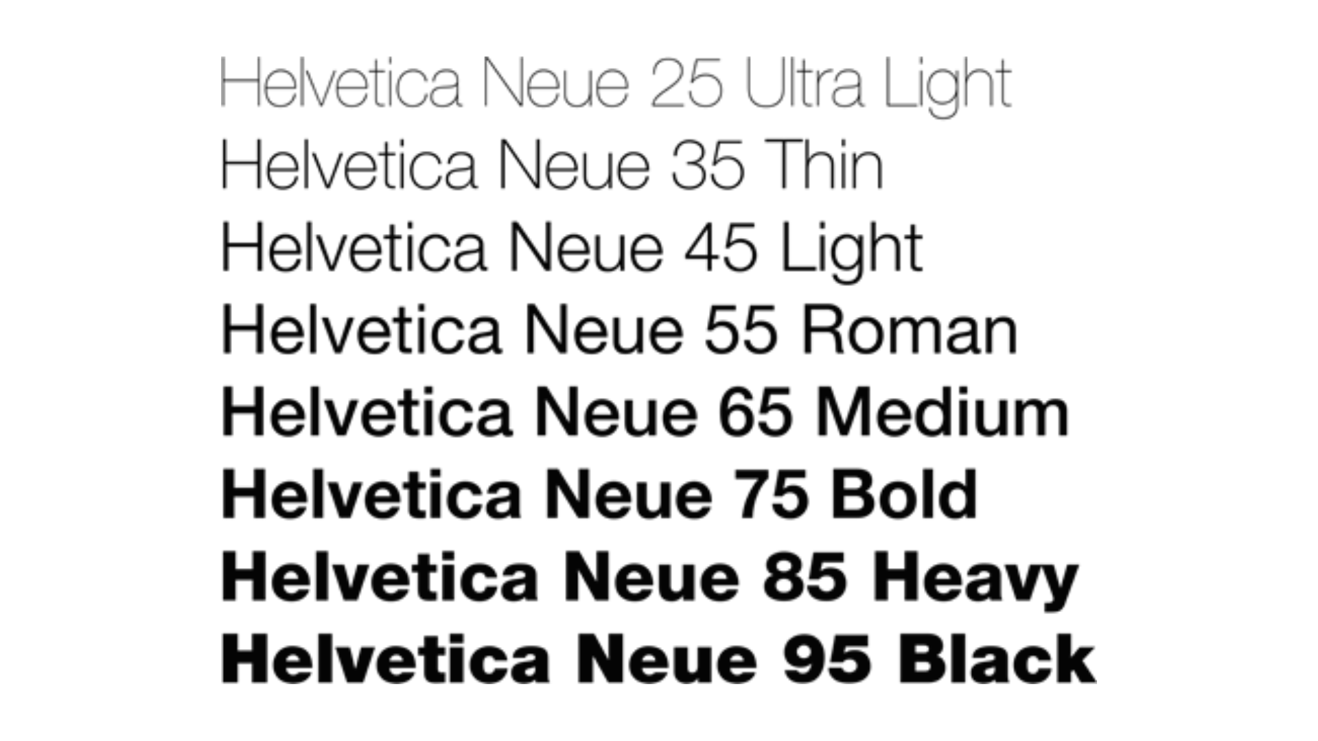
Website attracting audience
Even with varying letter width, letter thickness, and word length, you can still tell that these fonts all belong to the same font family, and therefore would still be cohesive when used together on the same website page.

How Will You Use Your Fonts?

Depending on your purpose for looking for fonts to use on your website, you might want to select different types of fonts that feature different amounts of flexibility in their design and usage.

Length of Use

Some fonts are more unique and stand-out, but as a result have much less longevity than other fonts that are more toned-down but flexible in their application. Take a look at the frequency and duration you’re looking to use a font. Are you only using it as a one time thing in a minor usage on your site, such as for a temporary promotional banner’s text or a small decorative feature on one of your articles? Or do you plan to use this font in the long-term and hope for it to have enough flexibility to accommodate any changes you might have to your website and/or content in the future?

Short-Term or Brief Use of a Font

If you only plan to use this font for a short-term purpose, you won’t need to worry about whether a font is connected to a font family that offers you a range of weights, styles, and variants, because you won’t have enough instances where you use this font for these concerns to factor into your choice of using this font. As long as the font isn’t too outlandish, you can go ahead and use a more expressive font to draw the attention of your site visitors and try to make a memorable impression on them.

Long-Term Use of a Font

If you plan to use a font on your site for a long-term and long-lasting propose, such as being the font that your entire website uses, or being the font of all your email updates to your website followers, then it would be best to select a font connected to a font family. As discussed earlier, font families offer you both flexibility and variety while keeping your overall presentation cohesive and professional-looking, so they’re a smart choice for anyone who wants to maintain a professional and synchronized visitor experience across all their site pages and communications.

What If I Want To Use More Fonts?

Using one single font across a website’s pages is the choice made by the vast majority of websites, because of the simplicity and consistency that doing so offers. At most, variety in a website’s text is introduced by using families of fonts that retain the same cohesive feeling of the fonts chosen, or by using 2 fonts that are cohesive with one another and don’t throw off the feeling of the other font. To consider wanting to use more than 2 fonts might put your site’s cohesive design at risk. You’ll have to make sure your different fonts compliment one another and effectively give a positive reader experience, because the impression you make on readers and visitors can greatly help or harm your site’s overall popularity and success. If your fonts end up looking off or otherwise not meshing well, readers are likely to take notice and see your website as one that lacks professionalism or neatness.
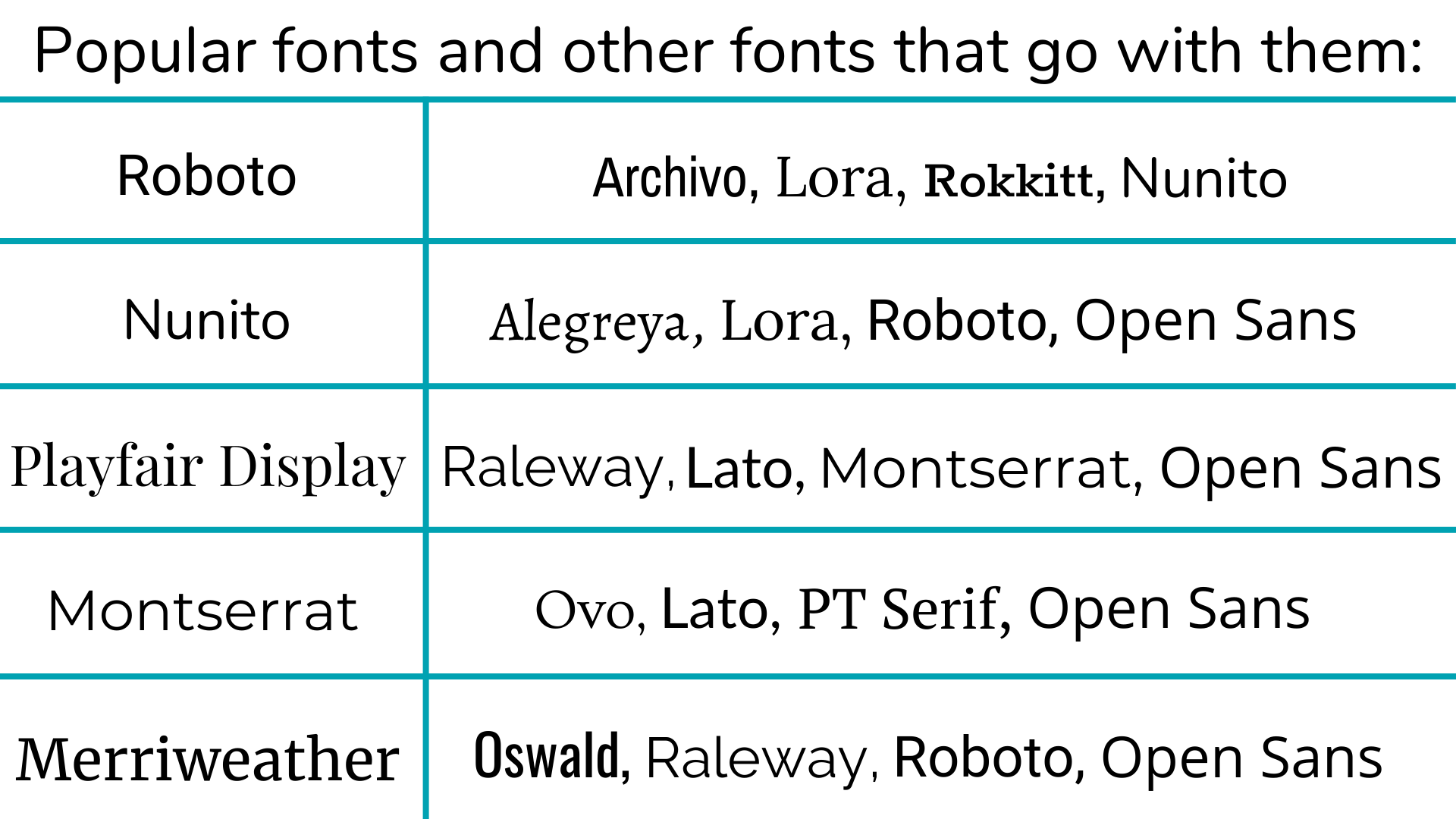
Website font compatible fonts image
Above is a useful table showing some of the most popular fonts and other fonts that they’re compatible with. You can refer to this table as a resource for if you’re deciding on using more than one font on your website.
Using beyond 2 fonts is something strongly discouraged and rarely done in web design and content writing. This is because of the typically unorganized and messy image that it creates for any website that does so. While you could say it may give some readers the feeling that what you’ve done is eccentric and unique, this decision might not be interpreted in such a positive light by every website visitor or reader. Using several fonts, especially if they noticeably differ from each other, is widely seen as unprofessional and unorganized. Readers will at best be confused and at worst be driven away from your website due to its unprofessionalism to seek out a different, more professional-looking site. This is why using 1 font is the most ideal, 2 is acceptable if done well, but 3 or more is strongly discouraged.
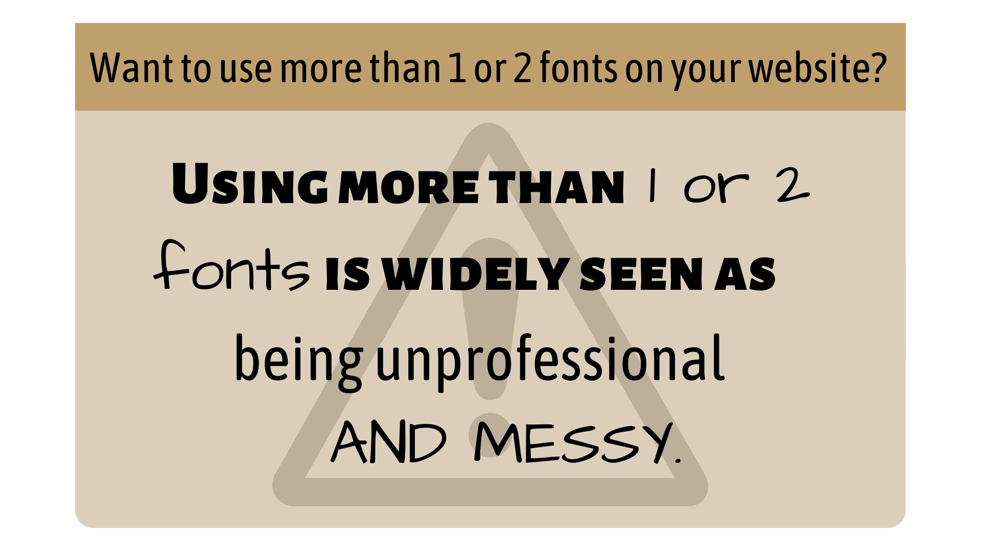
Website font using more than 1 font
As demonstrated in the image above, using several fonts, especially if they’re distinctly different from each other, detracts from the sense of professionalism a piece of content can have.

Font Choosing Steps

After discussing what should be considered before going into finding and selecting fonts, it’s now time for the actual selection process to begin. Fortunately, when going into choosing your website’s font, you can have several sources of guidance and ideation that can lead you to make better choices and come out with results that you’re happy with.

Finding Ideas

We all see countless varying usages of website design with different fonts across our usage of the internet. Think about website designs and fonts that you’ve seen before or that you’ve encountered during this process of considering what fonts to use for your website. From what you’ve seen, are there any designs or usages of font that have stood out to you or that you’ve taken note of for positive reasons? If so, try to find the websites of those design usages, make note of what fonts have been used and how they’ve used fonts, and consider what makes them stand out to you as a visitor of a site these font usages are on.

By understanding what about these font usages have appealed to your eyes as a reader, you can gain an improved understanding of what features of fonts, from letter thickness to the slant of lines and anything in between, appeal to you as a site visitor. Does the font combined with its content give you a cohesive feeling that makes you engage more with the written content? Does the feeling of the font resemble something else that would intrigue readers? These questions, and countless others that may come to you, can help you understand what makes font usage appealing to readers of its content. From here, you can apply your understanding to form a firm foundation upon which you can begin to build your own font selection process.

Google Fonts and Using Online Resources

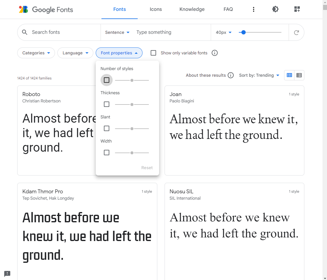
The process of finding fonts to use is made simple thanks to the existence of many font databases that you can browse and explore online. With websites like Google Fonts and Font Library, these font databases exist as showcases of different fonts and their font families that you can choose from to implement onto your own website completely free of charge. Different font databases let you sort your search by different properties such as line thickness, letter width, number of available styles, and more, so your search can be tailored to the sorts of features in fonts that you’re looking for.

A convenient feature with some font databases like Google Fonts is that you can directly download and import fonts from their site onto your computer to use in other apps like Photoshop. Once downloaded, these fonts typically come as ZIP, RAR, or 7z files. Simply right click the file and press the “Install” option that appears on Windows, or double click and find a “Install” option in the corner of the preview that appears if you’re using Mac. From here, the font will be added to your system-wide Font Book, and you’ll be free to use these imported fonts for anything you could think of. Open access to fonts at your convenience gives you the freedom to, for example, design your logo in Photoshop, or create promotional material to use on your site.

You’ll likely be drawing on these font databases for most if not all of the time you spend searching for fonts, so it’s best to familiarize yourself with how these different sites work, what they offer, and how they can help you find suitable fonts for your site.

Website font google fonts search
The freedom to search thousands of fonts by their properties means you should have no problem finding a font that suits your needs.

Yours and Others’ Tastes

Along with looking at applications of different fonts, think about if you have any ideas or expectations for fonts that aren’t directly taken from websites you’ve seen. Maybe you realize that you have a preference for rounded letters, or you’re looking for fonts that give off a straightforward feeling. Make note of these ideas so that you have a clearer and more developed idea of what font you’d like to find. The more details that you define about your preferences and what you’re looking for, the quicker and more efficiently you’ll be able to browse and find fonts that fit your website and your expectations.

If you feel that your own taste in fonts could benefit from having other opinions considered in tandem, or if you simply want to hear others’ thoughts on font usages that you’ve encountered, don’t be afraid to ask those around you about what their impressions are of different font usages. Whether they have web design or font selection experience isn’t important, and in fact, asking various people with varying ranges of experience in web design and working with font selection could work in your benefit, where you’re able to hear the thoughts and opinions that people from different backgrounds have on fonts you’re interested in using. Maybe your colleague experienced in web design thinks a font you’ve chosen is a good choice, but do your relatives that are more similar to your actual demographic of website visitors think the same? Hearing from more viewpoints might inform you on which fonts are better choices over others.

Something that you should consider for using fonts is how it affects the performance of your site. WordPress allows you to use custom fonts on your site and gives you freedom to design your site however you want to, but these custom fonts might also slow down the loading speeds of your site, which can greatly impact your visitors’ site experience. If you’ve built a WordPress site that also uses custom fonts you’ve uploaded, I’d strongly suggest you install caching plugins to reduce your page load times, and I’d also suggest you find a site host like Doteasy. They offer server-side PHP caching for improved efficiency and flexibility in letting sites install extra caching plugins to enhance their WordPress site functionality. They helpfully offer a WordPress Resource site sharing theme and plugin recommendations that anyone can use, and I also know from personal experience that their in-house support is very knowledgeable when it comes to WordPress. They also seem to have direct involvement with WordPress and its resources, as they’ve sponsored WordCamp events, which are WordPress community gatherings, in the past. Overall, they seem to be a solid and reliable place to host a WordPress site.

Closing Thoughts

With everything being said, you should be all set to use your newly-found font on your website’s content. Remember that it’s not a race to find the perfect font for your website; don’t be discouraged if you don’t immediately find a font that strikes you as the perfect one.

After you’ve found the perfect font, make sure to implement it consistently across your site’s pages. If you’re unsure about whether the font fits your site, you can always compare the overall presentation of your site to other sites with fonts and designs that you find appealing, or look around online for resources like compilations of appealing website designs and other articles about selecting fonts for your site that demonstrate the sorts of designs found to be pleasing and effective at drawing in visitor attention. Want a review of the basics? Take a look at this article about the basics behind choosing fonts for your website.

With the right font on your site, and equally effective visual and color designs, your website’s quality and appeal can be elevated to give you an edge over competitors and let you define your site in the minds of your visitors and readers.