Website Fonts: The Basics

Jul 6, 2022

Have you ever wondered about what goes into designing and using different fonts online? You might be surprised by the significance of something that you should never notice when done well. Typography is the field that website fonts fall into, and just like CGI in movies or internet speeds, it’s something that’s hardly noticed when done well and only stands out to the average person when done poorly. Typography is the art and technique behind arranging, styling, and using text. It’s crucial in determining the reading experience of your content, yet it’s something that usually flies completely under an everyday person’s radar. The better the typography, such as a website using a pleasing font choice or being consistently designed throughout, the less we notice it. It’s only when poor typography is present, such as when an illegible font is used or when a website features obvious design inconsistencies, that we can realize how crucial typography and the use of fonts is when designing websites. With typography and fonts comes a whole slew of vocabulary that might be easy to get confused by, and when first choosing what fonts to use on your website, there are several important aspects to think about. That’s why in this article I’ll be teaching you about the foundational vocabulary that you see being used surrounding typography and fonts used online. After we’ve laid down the basics, I’ll go through a few important considerations you should make when considering what font or fonts to use for your website and/or its content.

In this article, we’ll be talking about:

Basic Terms

Before we go any further, we’ll go through some foundational vocabulary and terms you’ll see when working with typography and fonts. This is so that you can get a clearer understanding of what and how fonts’ appeal is considered, and from this, you’ll hopefully get some clarification to any questions you might have. After this, we’ll go into what to think about when choosing fonts for your site.

What’s In Typography?

As mentioned earlier, typography is the art and technique behind arranging, styling, and using text. It’s a term constantly applied online and is crucial in determining the reading experience of your content. Within this blanket term are several more terms that should be understood before we go further into deciding on how your website will look.

The term typeface is applied to a broader grouping of individual fonts that are grouped together thanks to their shared and/or similar aesthetic qualities. The phrase font family can be used instead of typeface, but rest assured knowing both mean the same thing. The term font, meanwhile, refers to a singular specific font that’s been chosen for use, and as a result can have its size, weight, style, and more altered on an individual use-by-use basis to suit what’s needed of it. What’s the difference between a typeface and a font? Think of typefaces like a genre of music, where differences might exist between the songs of the genre, but at the end of the day each piece of music is united by their sharing of similar qualities and elements. Now think of fonts as individual songs, where each song is distinct from each other, but individual songs/fonts have similar features that mean they can be grouped together into a genre/typeface. Even though typefaces and fonts might be incorrectly used interchangeably by some sources or people out there, remember that these two terms in fact refer to two different concepts within typography.

What’s In a Font?

 A font’s size decides how large it appears to readers and is typically adjustable when creating and building websites, which is straightforward to understand. A font’s weight is what measures and decides whether the font looks bolder or lighter to readers. Text stylizations are the settings that cause common visual alterations you’ll see applied to text, such as text being italicized, how spaced apart text is, and what color the text is. Text stylizations give you control over an individual font’s features, so that any font can be altered to better fit your unique instance of using it.

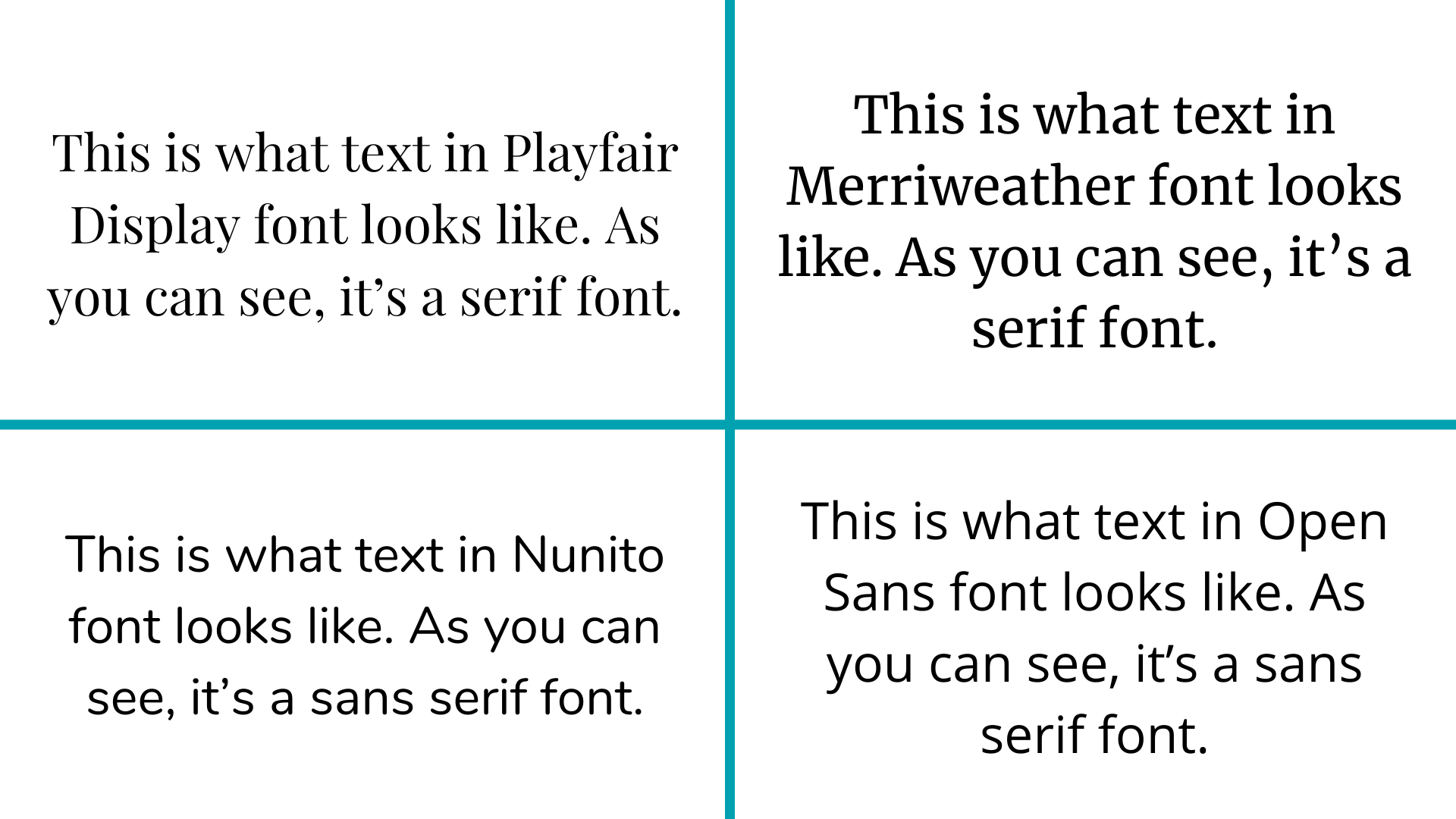
If you’ve browsed fonts anywhere, you’ve probably come across the terms serif fonts and sans serif fonts. A serif is an ornamental embellishment on letters as an aesthetic addition implemented in some fonts. Fonts that are designed with serifs are called serif fonts, and examples of common serif fonts are Playfair Display, Merriweather, and Noto Serif. Fonts that are designed without serifs are called sans serif fonts, and common examples of sans serif fonts are Nunito, Open Sans, and Montserrat.

Another type of font is script font, which is designed to have the fancy, flowing, and unbroken look of handwriting. It’s used much less commonly compared to serif fonts and sans serif fonts due to it being harder to read and, unlike serif fonts or sans serif fonts with their flexibility, only being suitable for usage in specific scenarios, such as for special titles on pages. This is why you’ll see this type of font used much less compared to serif and sans serif fonts, which are the two kinds you should be keeping your considerations to when picking fonts for your site.

Website font fonts serif sans serif comparison
As you can see, the presence or absence of serifs can make a big difference in how your text looks.

Tracking is a term used to describe the spacing between all individual letters and words when using a font. Tracking can be used interchangeably with the term line space, a term commonly seen in the world of HTML. It’s important to present proper tracking in your content, or else odd spacing sticks out to readers like a sore thumb, since things are too cramped-looking or too far apart from each other. Leading is a term used to describe the vertical distance between separated lines of text. It’s a term that can be used interchangeably with the term line height that’s often seen when working with HTML. For example, when you refer to concepts like having text single-spaced or double-spaced, you’re really referring to leading.

Content Hierarchy

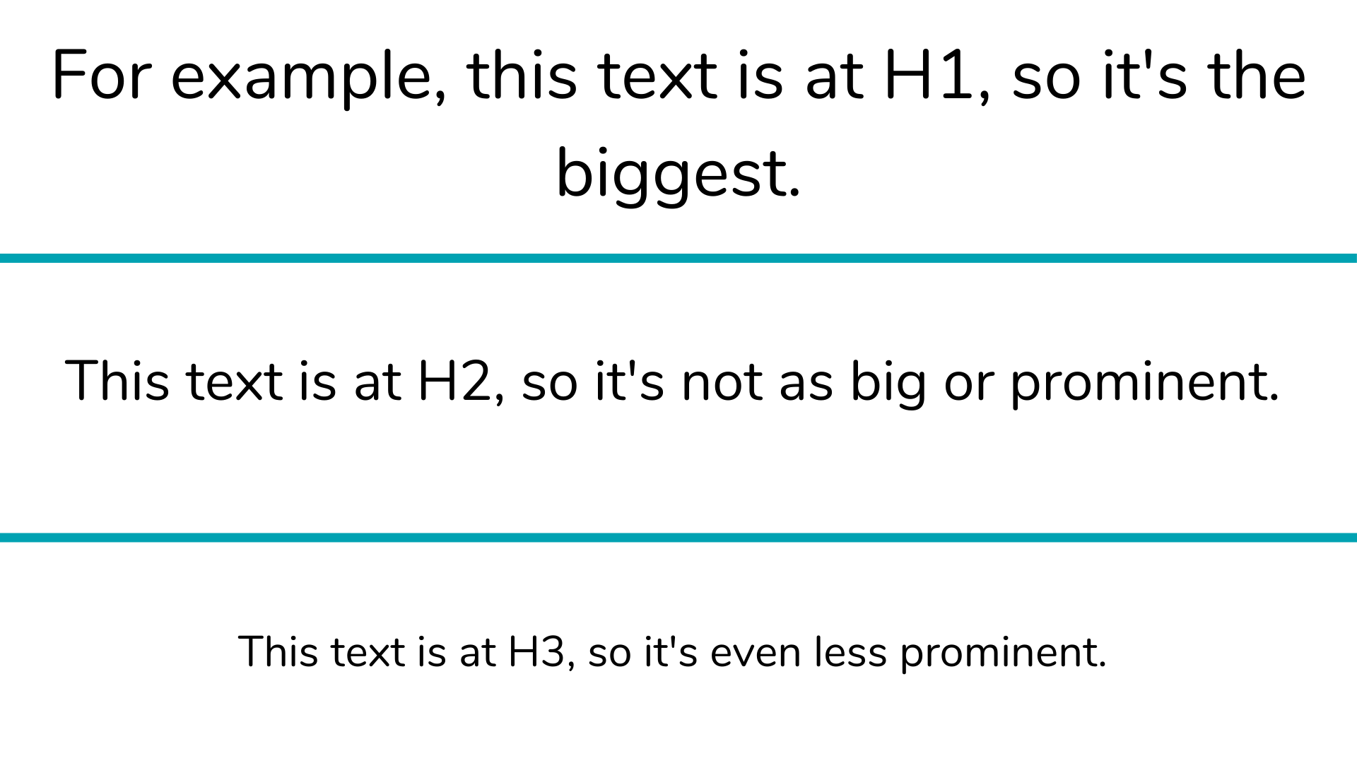
Content hierarchy is the concept of designing elements of a page, such as headings and text, based on which of these elements is most to least prominent. Different font sizes, weights, types of typefaces, and more can all be used to demonstrate a hierarchy of content to your readers. The headings feature that many website creation tools have lets you set hierarchies with differently-ranked headings, where, for example, the title of your page would be the most prominent at Heading 1 or H1, and following headings would be at H2 or H3 depending on their prominence.

Particularly, Heading 1 or H1 is key to a site page’s SEO because of its role as an indicator for a page’s title. Its use is critical for search engine bots to determine what a page’s content is about, and is often the first and most pronounced thing that your visitors’ eyes will fall upon since H1-tagged content is typically shown in bigger text on screens. Effectively using H1 text is important. You should only have one H1 title per site page, you should have at least one of your target keywords included in your H1-tagged content, and you shouldn’t use each of your target keywords more than once in this tagged content. H1 text’s significance to search engine bots is why you should be mindful of these hierarchy rules when designing your site pages’ layouts.

Website font H1 H2 H3 hierarchy compare

This image demonstrates the typical size distinctions of H1, H2, and H3 text that you will commonly see across online articles.

Now that we’ve covered all the basics about typography and font, let’s get into what we should consider when picking out potential fonts to use for our content.

Reader Behavior

The purpose of choosing a suitable font for our content is to appeal to our site visitors and readers. This is why it’s important to understand how they behave when interacting with our content.

Short Attention Spans

In our current age of endless digital content being published and accessible online every moment of the day, attention retention of readers online has never been more difficult. Consumers are fickle: a study from Microsoft found that the average attention span of a website visitor was only 8 seconds, which is below even that of a goldfish. When site visitors find themselves displeased, even subconsciously, by any small aspect of a website that they find unappealing all it takes is one click for them to go back to their search engine and find a different site from yours to give their interest to instead. This is why font choice is key to execute properly, otherwise you risk driving away sizable portions of your site visitors without even intending to.
Website font goldfish memory in a tank
When your audience has a shorter attention span than a fish, it’s important to do everything you can to cater to their attention and retain their interest in your content.

For example, picking a bad font that has odd leading, or is very illegible to the majority of people, can easily make readers decide that they don’t want to stay on your page and struggle to read what you’ve posted. Instead, they’ll leave your site and likely settle on an alternative site with a more pleasing font to them. On the other hand, picking a suitable font that is appealing to readers means more of them are likely to prefer staying on your website to continue looking at your pleasantly-designed content, even if they don’t subconsciously think or realize this about themselves. These examples show why font selection should never be overlooked as an important part of appealing to your site visitors and their behaviors.

The Problem of Skimming

Anyone who has ever read content before will know that sometimes, for one reason or another, the content you’re reading loses its ability to hold your attention, and you begin to skim over words, phrases, and sentences. This is something that, as a content writer or poster, you don’t want happening to your content. Readers skimming over content demonstrates a loss of interest in what your content has to say, so they’re much more likely to leave your site sooner compared to someone who’s engaged in your content.

Unappealing font choice is a big factor which websites control that can contribute to whether readers often resort to skimming. Poor choice in fonts can mean letters blend together, the content feels crowded, or other elements of the text make things feel difficult to process and not worth spending time on deciphering. If you choose to write your content with, for example, an illegible font, or font that has very strange shapes and takes too much time just to decipher and then read, it’s likely that many readers will get annoyed with needing to redo this process every few words they advance through in your content, and instead opt to continuously skim over your content. Fonts that are dense, cramped, and overall feel more like a solid wall of text instead of individual words to read will also have this same effect, because your content will blend together in readers’ eyes until it seems to be nothing of actual substance.

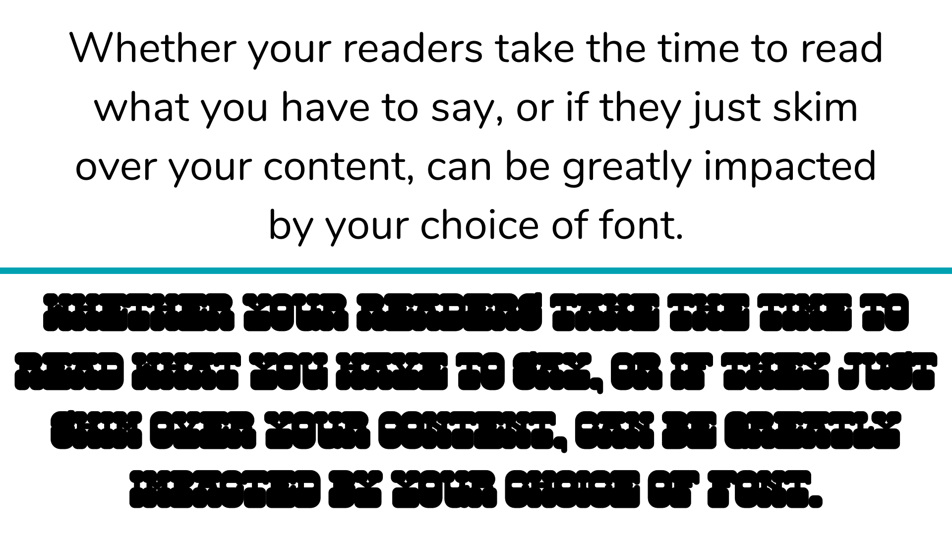
Website font legible fonts comparison image

Which font are you more likely to give up reading and skim over, the font you can clearly read, or the font you can hardly read?
If the issue of unappealing font choice is persistent and frequent enough in your content, more and more readers might opt to leave your site entirely to save themselves the trouble and patience of having to decipher words through your poor choice in fonts. The ability of poor font choice to lose you site visitors and their interest is why you want to select a clear, simple, and completely legible font that anybody can immediately read and progress through. When content feels approachable thanks to its simplistic font choice, rather than feeling frustrating and unappealing, site visitors are much more likely to remain on your site and maintain their interest in your content.

Accessibility

With countless ways for people around the world to access and read content online, your choice of website font should be considerate of the varied needs and backgrounds of people in order for as many people as possible to have a pleasant reading experience with your content.

Access From Different Devices

Finding an appealing font to go along with your website’s content is a great success. The issue is, however, that not all fonts are available and visible for all devices, which can cause problems for you and your site on the reader accessibility front. Every device comes with a pre-installed selection of fonts that it can access and display, but depending on a device’s operating system like Windows, Android, or iOS, the selection of fonts available to a device can vary greatly. When a font is trying to be displayed by a device that isn’t available to that type of device, it will instead default back to using a typical and much less unique font, like Times New Roman. In this particular instance, your site being displayed in Times New Roman rather than the font you chose might give site visitors the impression that your site is very low effort and outdated. This is more likely to happen if, for example, the font you’ve chosen to use is appealing but also not incredibly popular, and as a result is unfortunately not installed on every major type of device that people use to read content online. The worst part about this is that your visitors will probably not even know why this is happening, simply assume that you’ve just designed your website in an ugly way, and be compelled to leave your site because of what they perceive to be an intentional blunder in font choice. Unless you use or have access to that specific type of device that this issue comes up on, it’s very hard for you to discover this problem on your own.

Web Safe Fonts

The best solution to this issue that I’ve just outlined is to make use of web safe fonts. Web safe fonts are fonts that appear and function properly across all operating systems thanks to overlapping across different operating systems’ font coverage. Using a web safe font, any site visitor, regardless of the way they’re accessing your website, will see your site the way you intended for it to be seen. With web safe fonts, you can either choose to use a web safe font for all of your content by default, or you can choose to use a non-web safe font for your content but specify for your site to fall back on a web safe font as a default backup to the non-web safe font. This is called a font stack, and it will only come into play should there be readers accessing your site from devices that can’t display your non-web safe font. Different website design and building services offer differing levels of consideration for web safe fonts. Some of them explicitly cater towards having their users implement web safe fonts, while others have no considerations for web safe fonts and give users complete discretion to use any font they want, even if it’s entirely not web safe. For those of you who’d like to implement web safe fonts into your site, you’re probably looking for a site building service that works like the first of my two examples. From my experiences, something I like about the website.com website builder, which I’ve worked a lot with, is that all the 100+ fonts you can choose from in their website builder are web safe fonts, meaning you never have to worry about if all your site visitors are able to see your content the way you intend for them to. This can bring you better peace of mind when it comes to designing your site and ensuring its font accessibility.

Final Thoughts

Fonts might not be the easiest part of website creation and design to get used to, but hopefully after reading this article, you should be more informed and knowledgeable of how to approach typography, fonts, and appealing to readers with your content. Remember that what I’ve just shared today consists mostly of basic knowledge and tips, so there’s still a ton of room for you to experiment and try out new things with your website to see what suits your site. For a more in-depth dive into choosing fonts for your website, stay tuned for an article that talks more about different aspects of finding and choosing fonts to use for your site!