How to Create a Landing Page?
A Step-by-Step Guide for Creating a Landing Page
You’ve always wanted to be a lawyer since you were young. You’ve spent four years getting an undergrad degree, passed the Law School Admission Test and attended a law school, did multiple internships, and passed bar exams. After years of hard work, you’ve finally obtained your licence and landed a job in a law firm. Here comes your first challenge, you need to find a way to attract and build your client base.
The good thing is, we are now living in the digital age where the majority of the world population knows how to use the internet. Other than traditionally getting new clients by connections and referrals, you can now also make use of the power of having a website and create a dedicated web page aimed to gain more client leads.
What is a Landing Page?
A landing page can be a website, but what makes it different from a regular website is the purpose of a landing page.
For starters, a landing page is a standalone web page usually used for marketing or advertising purposes. While regular websites present your brand in the online sphere. Landing pages are typically designed with a specific goal in mind, these are web pages your visitors will land on after clicking on an ad on another website or from social media, or a link from a promotional email.
Examples of landing pages include:
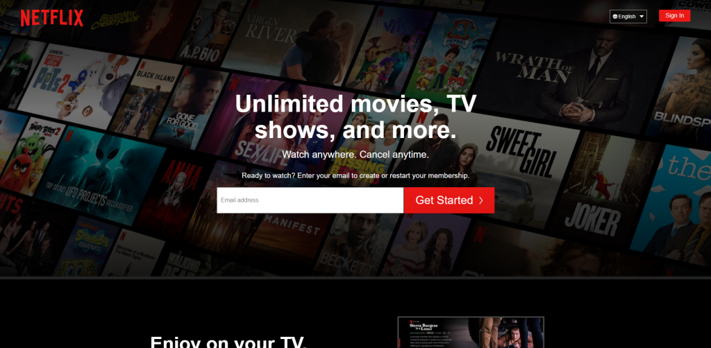
Netflix: Simple and straightforward step-by-step web form for visitors to sign up for their service
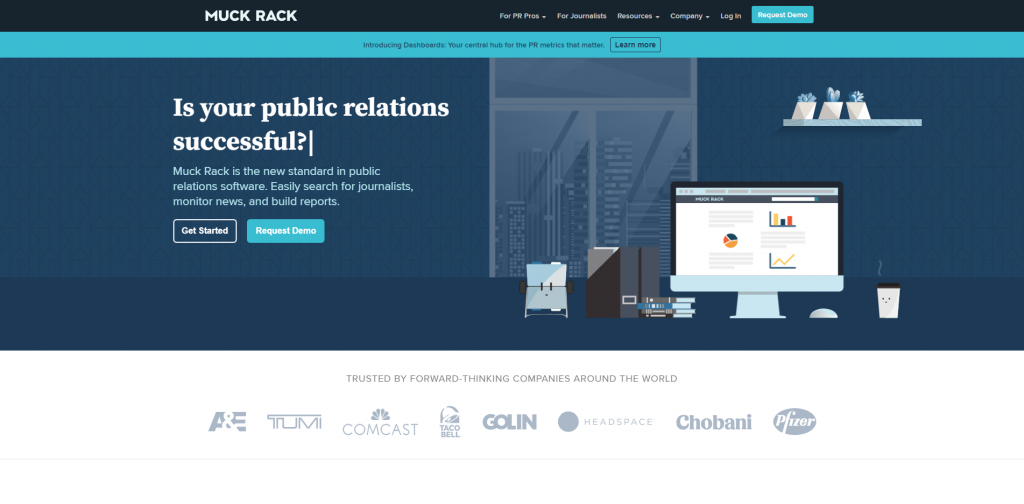
Muck Rack: Consistent design of their CTA buttons, both leading to a similar outcome. Bright blue CTA button for those who wanted to try out their service, while the other (bright blue on hover) is a direct link to officially register for their service.
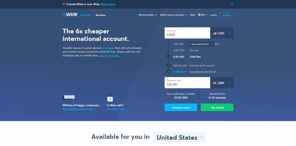
TransferWise: Multiple CTAs to show you the benefits of using their service and establishing their credibility. While they might have different links taking you to different web pages within their domain, their green CTA button is always standing out from all others.
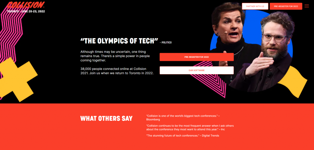
Collision: Straightforward registration button right at the middle of the landing page, there is basically no way for a normal visitor to miss this CTA button. Unless you click onto their menu button or scroll all the way down to the footer section, every button and web form field on this web page has one common goal, to obtain visitors’ contact information for further marketing and/or collaboration purposes. Even when you click on the speaker photos of their 2021 conference, a popup will appear without sending visitors off to other pages.
Identify the Goal of Your Landing Page
The approach of your landing page could be very different depending on what you want to achieve in the end. So the first thing you need to do is to define the goal of your landing page?
There are three main types of landing pages:
1. Click-Through Page
This is the most common type of landing page with a large, clear, and sharp CTA button relatively at the center of the landing page. The main goal of these pages is to get people to click the button. You want to turn your visitors into potential customers and get them into your sales funnel.
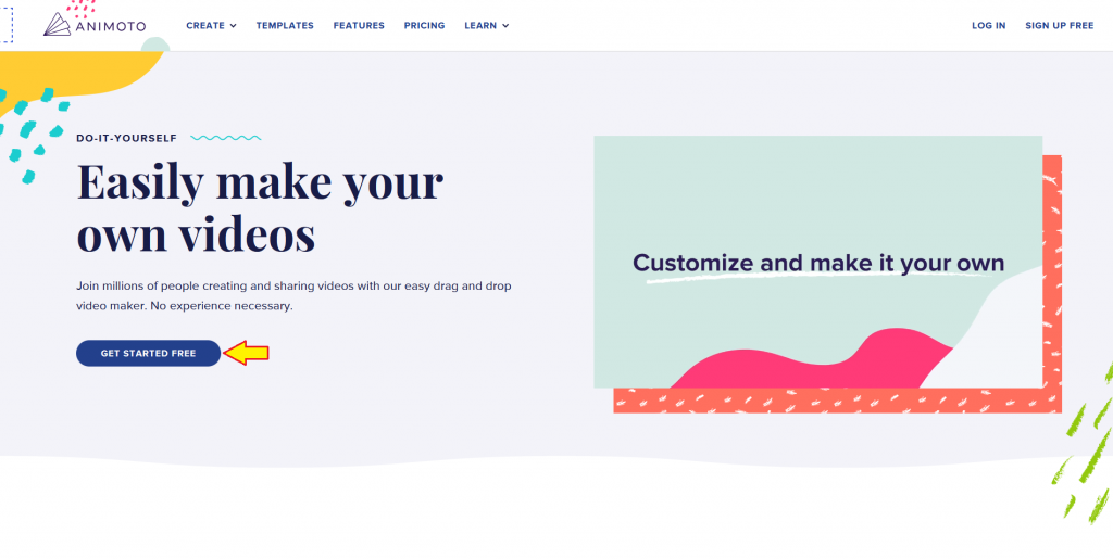
Animoto has a good balance of the information of their service along with links leading to pages that further give details of specific features, and a good mix of text and multimedia elements to attract their visitors. All their CTA buttons on the web page will eventually lead you to the same destination.
2. Squeeze Page
Also known as a lead capture page, the goal of a squeeze page is to turn a visitor into a lead by collecting visitors’ contact information—usually their email and name. The idea behind these pages is essentially to “squeeze out” people’s information by providing something in return. You are persuading your visitors to willingly provide their contact information knowing that they will get something valuable in return.
Daily business newsletter Morning Brew utilized their landing pages perfectly to capture their leads. Their design is simple, with their CTA and web form field at the top of their page. At the last time showing their latest articles giving prospective readers the kind of content they would be expecting to get. The headline is pretty catchy too. To “become smarter in just 5 minutes” by providing my email only, I’m all in! By the end of 2020, their largest newsletter “Morning Brew” had at least 2.5 million subscribers.
3. Sales Page
A sales page, or an infomercial page, is the longest form of a landing page. You are expecting to see a lot of information about a particular service or product on this specific type of landing page. The idea of this approach is to keep the visitors engaged with the content, making them read through the web page from top to bottom and get to know more about what you are promoting without the need to jump in and out to other web pages for more additional information.
It is important to note that if your sales page is filled with text, a bunch of text, it is less likely your visitors would want to keep engaging with your page. Simply, since it’s not visually interesting enough. Playdate’s landing page is mixed with plenty of multimedia elements—text, the product images, graphics, audio, video, interactive designs, all for promoting the portable game system.
Landing Page Must-Haves
Let’s move on and talk about the landing page must-have elements.
CTA Buttons
A CTA button is the navigation link that guides your visitors to a specific destination and takes an action that you want your visitors to take. Say you are promoting a new product, your goal is to maximize the sales. Your CTA would be to get people to buy the product. You could create a limited-time offer or a special discount deal, the CTA button on your landing page would be something like “Shop Now!”
This HelloFresh landing page is not fancy, but you’ve got all the necessary elements on the page. A simple and consistent design with bolding important elements, and telling people to “get started” with signing up for their meal boxes while enjoying a $60 off by clicking the CTA.
Hero Banner
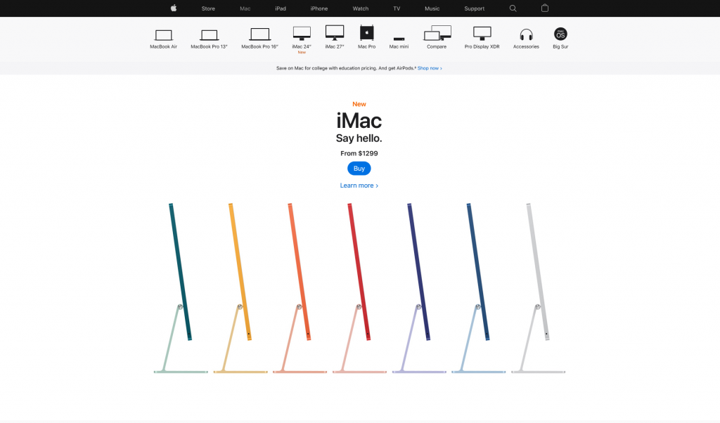
Whenever someone says “hero section”, they are referring to a full-width section that appears “above the fold”. It is essentially an area that is viewable on a person’s screen without scrolling away. The height of the hero section varies depending on a person’s preference, and there is no definite height suggestion due to varying screen monitor size.
In general, anything that appears in this section will be among the very first content your visitors will see once your web page finishes loading. This will be their very first impression of your web page, the design and content should be eye-catching with the relevant multimedia elements (graphic, image, or video) and a strong CTA. It needs to capture your visitors’ interest and lead them to take action.
Source: Apple
Web Form
Whether you are going for a hybrid or an online-only business, being able to communicate with your customers remains vital. In addition to in-person inquiries, e-mails, or phone calls, you can also embed a simple web form on your website. Web forms come in handy when you start organizing your messages via a system. It could also make it easier for your visitors to send in inquiries by filling a guided form, as compared to thinking and drafting an email from scratch. There is, however, no “one size fits all” approach to these forms. The fields needed, formats, and length varied case by case, but some essential elements/fields include:
- Clear headlines — provide clear instructions to tell your visitors what to do
- Relevant fields — people value their privacy and personal information. Therefore when designing the web forms, make sure to only include relevant fields. Say if you are trying to get people to sign up for a newsletter, you would only need people’s email and maybe their names, but not their phone numbers.
- Submit Button — a web form wouldn’t be complete if visitors can’t send it out. Not only are you confusing your visitors, but you are also wasting your energy and time put into crafting your landing page.
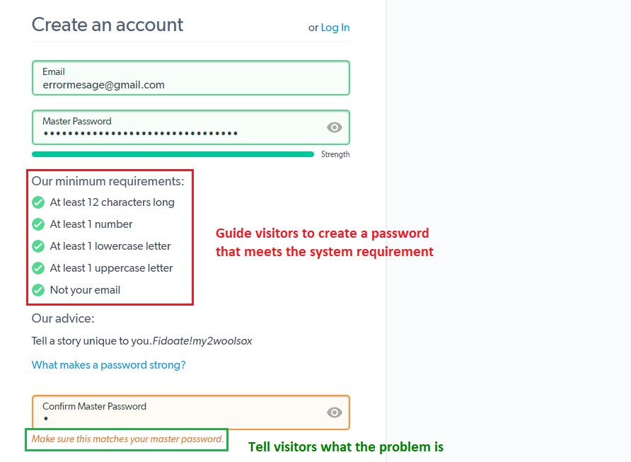
- Instructional messages (or error messages) — some people might have activated validation to certain form fields to ensure the accuracy of information from people when filling the form. If someone has inputted incorrect information or data that are not properly formatted, this is where error messages come into play. They can be used as a guide (red) or telling them what they should do (green) to resolve the issue.
Source: LastPass Create an account page
These are the three most common types of web forms:
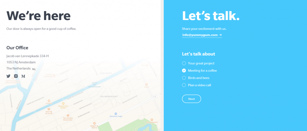
Contact forms—your visitors can send in inquiries, submit complaints, or just connect via this kind of form. (I will have a separate article specifically on contact forms)
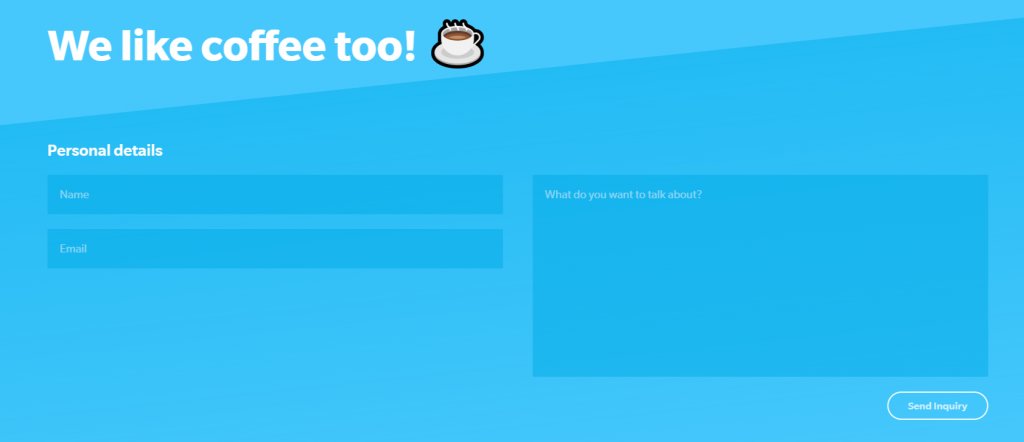
Yummygum’s two-step contact form first asks for the purpose of the message.
The system will then take visitors to the respective contact form depending on their choice
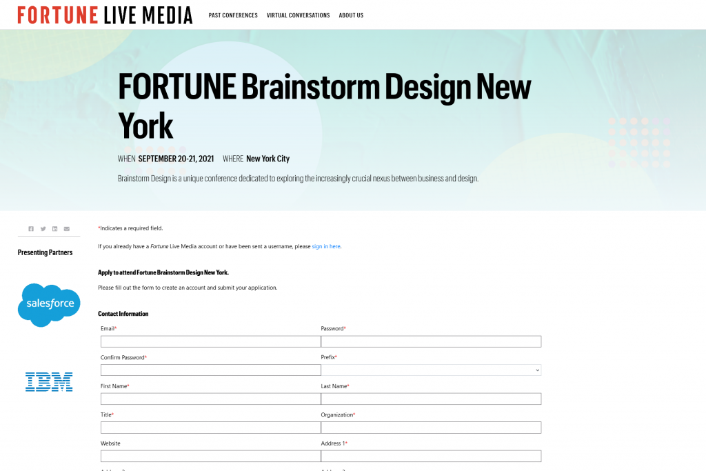
Registration form—this is useful if you are promoting an event, particularly when you need to confirm the identity of attendees during admission
Source: Fortune
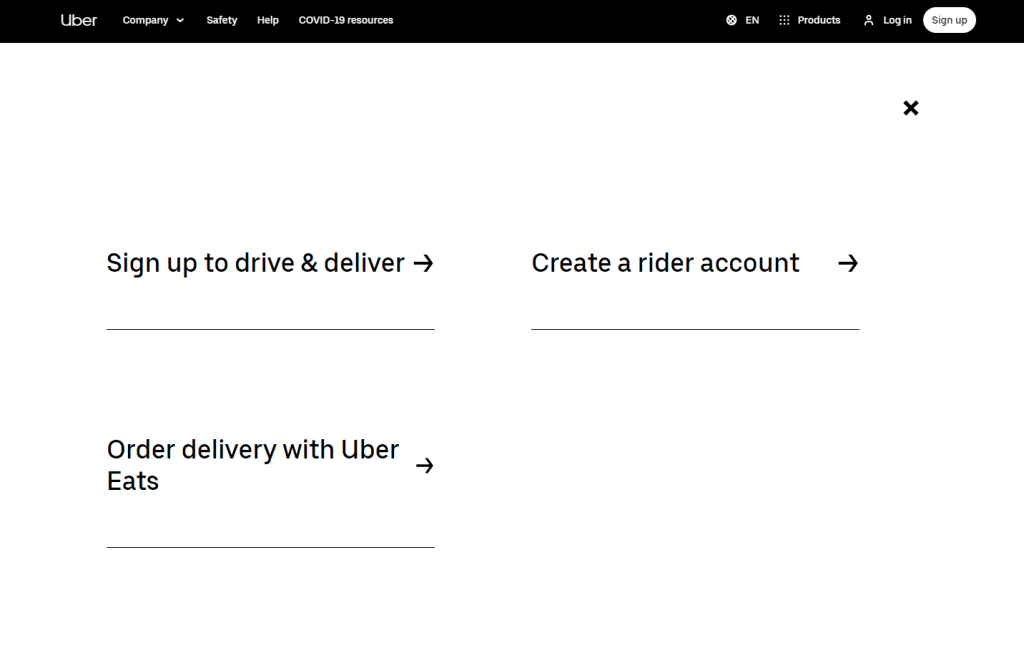
Lead generation form—similar to registration form, it is used to collect personal information, but rather focused on converting your website visitors into potential leads.
Simple lead generation form from Uber gets right to the point targeting different users. Not the typical “sign up and ask later” kind of lead generation form
Choose A Platform For Your Landing Page
When planning to create landing pages, people will generally be choosing between these platforms—content management systems (CMS) platforms, landing page builders, and website builders.
- CMS platforms (E.g. WordPress)
This type of platform often offers much more flexibility in building a website, but it also comes with a price—relatively higher technical expertise and a steeper learning curve. If you know some coding and wouldn’t mind spending hours customizing your template to get exactly what you want, this could be for you. CMSs are also open-source platforms, meaning you will be able to find tons of guides and tutorials available online. The downside? You are the one solely responsible for your website if you encounter any technical issues. - Landing page builder (E.g. Unbounce, Instapage, and Leadpages)
These are platforms solely for creating landing pages. Users can create landing pages using the templates provided, all specifically designed to fit different needs for landing pages. - Website builders (E.g. Wix, Squarespace, and Website.com)
They are very similar to CMS platforms, but it’s easier to use and much more intuitive than CMS platforms. They have a visual editor where you can drag and drop elements onto your web page, and fine-tune by rescaling pixel values. It is extremely user-friendly, beginners can easily start building a website without much tech knowledge. The main disadvantage of these website builders compared to CMS platforms is that website builders are relatively less flexible and customizable.
When thinking about building landing pages, also think about whether or not you would want to have a website. Treat the website as the hub of all your products, detailed information of your products, and the “face” of your business. A landing page is an additional web page for you to say “hello” to new and existing customers from time to time by providing something valuable.
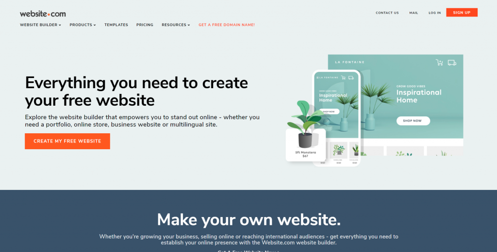
With that in mind, I will suggest using Website.com, a simple to use drag-and-drop website builder. You can start creating landing pages using their templates, and opt to expand into creating a website in the future. What’s best about Website.com? You can almost use all their platform features for free, and upgrade to their paid plans when needed.
How to Create a Landing Page
If you don’t have an account at Website.com, sign up today and select a plan that fits your needs.
If you’ve already registered an account, all you need is to sign in and select a template.
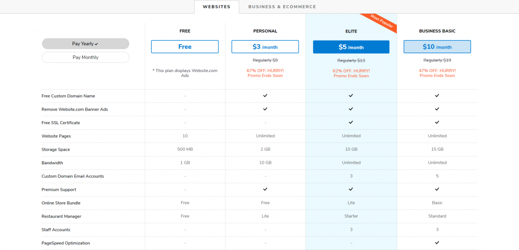
Remember, you can first try out their service and later upgrade to paid plans as your website grows. Click here to check out Website.com’s price plans.
Create your domain name
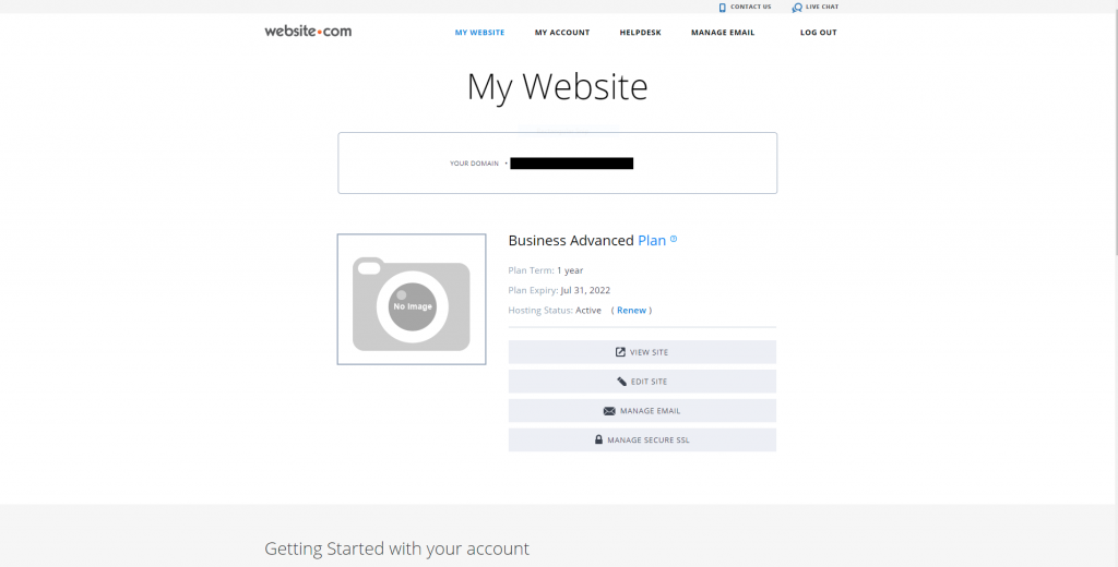
A domain name is essentially your “online name”. It represents who you are and what you do. One important note. If you are serious about your business, it is always recommended to register for a custom domain name. For this example, I have signed up for a paid plan to get a free custom domain name.
If you are serious with your business, it is always preferred to register for a domain name, it gives your online presence instant credibility and makes it easier for visitors to search for you.
A custom domain name increases your credibility, and it is also easier for visitors to search for you. Here are a few useful tips for creating a domain name:
Use a name that represents you or your business
Make use of your name or your business/company name. If you are creating a personal website and you’ve got a very common name, adding your profession or hobby might increase your chance to register for a domain name you desire.
Use a common domain extension
You might have come across some websites ending with .ai, .io, .co. No worries these are all legitimate websites, they are just using relatively newer domain extensions since the online world is already flooded with a lot of traditional ones like .com, .net, and .org. Newer extensions are good if your website has a specific niche and specific target audience group. But if you are aiming for a wider and more general group of audience, it is always better to go with the traditional ones since those are more likely to pop up in people’s minds. Also, people are more likely to see websites ending with .com, .net, .org more credible and professional.
If you want people to know where you or your business is located, or you know where your intended audiences are located, you can opt for geographical specific domain extensions (country code top-level domain, ccTLD)—.us, .ca, .uk, .de, etc. However, be aware that there might be specific requirements for registering certain ccTLD. For instance, to register for .us ccTLD (United States), it requires that the registrant must be a U.S. citizen, resident, organization, or a foreign entity with a presence in the U.S.
Make sure it’s short and easy to spell
You never know who might be visiting your website, nor can you predict the English capability of your website visitors. If your name is too long, or you’ve included some sophisticated words that might be difficult to spell for a non-native English speaker, change it or simplify it. Also, try to avoid putting the same alphabet together. The more repetitive it is, the higher the chance for a regular person to misspell your domain name, and failing to reach your website.
Once you’ve chosen your domain name, you’re set to create your landing page.
Choose a landing page template
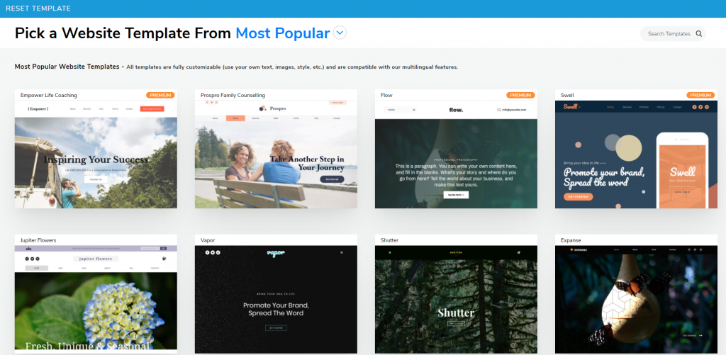
Website.com offers over 500 website templates to fit different needs, colors, and fonts all picked by professional website designers.
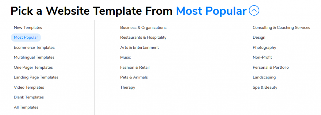
To view landing page templates, click Most Popular and a dropdown menu will appear showing all available templates, sorted in different categories.
I’ve chosen the Legal Advisor template for my landing page example.
Note: You can always opt to build everything from scratch. But if you don’t know much about website building, and don’t know what you need on your landing page, I will suggest you go for the template option instead. At least you would have all the necessary elements of a landing page and has the option to add elements as you need.
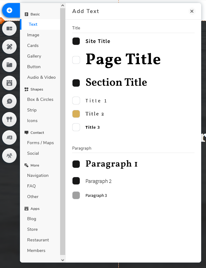
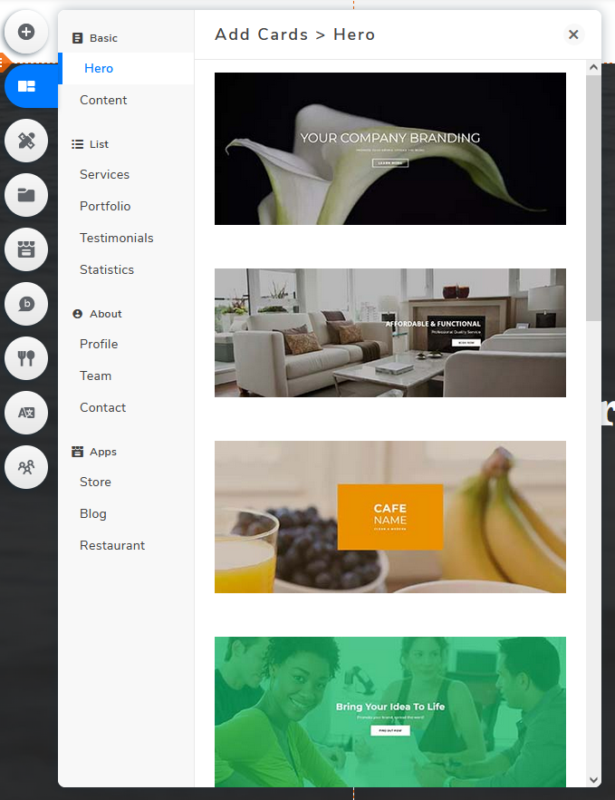
To add elements to your landing page, click Add Elements or Add Cards.
Add Elements
Add Cards
Click here for more details on adding elements to your landing page.
Next, let’s start customizing the web form.
To give it a different headline, select the text you would want to edit and press the Edit Text button to customize the words.
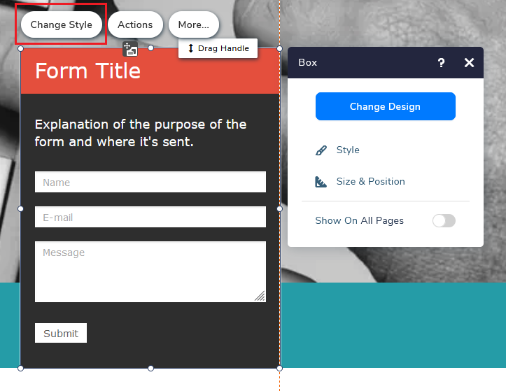
If you wish to change the design of a specific card, choose the card and click Change Style. A pop-up will appear where you can change the background, border, and shadow.
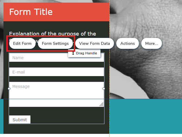
Next, choose Edit Form or Form Settings to customize the content or the settings of the web form.
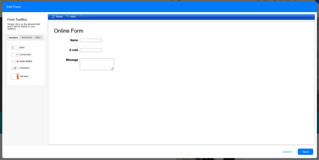
Here you can add, delete, edit and reorder the web form fields.
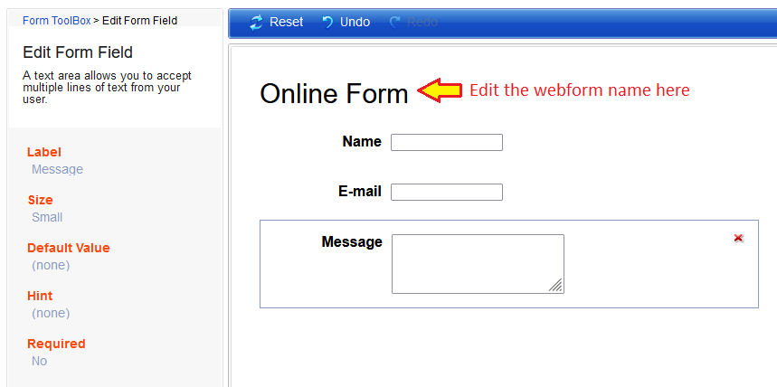
In order to customize each field, such as changing the name or changing the mandatory settings, click on the field you wish to edit and start customizing it. You can also change the name of your web form if you have multiple forms on your website
Remember to click Save at the bottom right once you’ve finished applying changes.
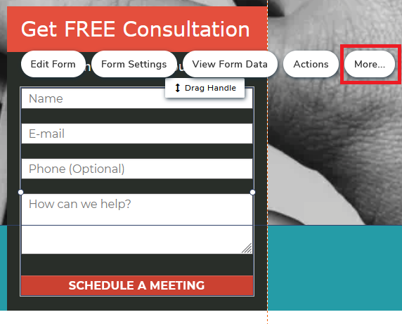
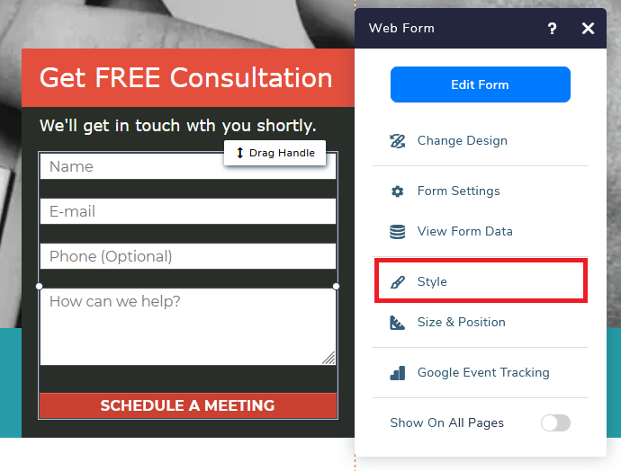
Changing the design and text of the Submit Button will be a bit tricker. You will need to select the web form element and click More.
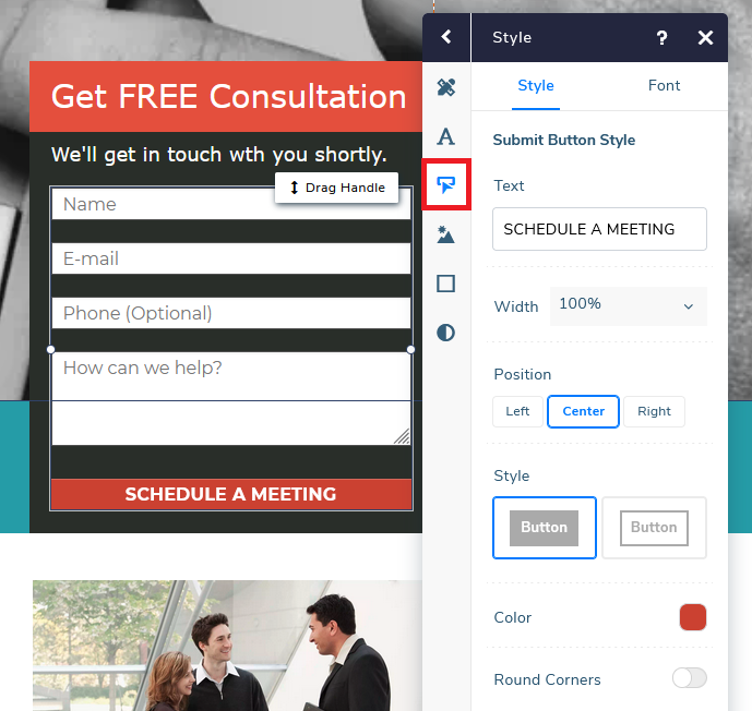
A pop up will appear, choose Style
Select Submit Button and you can start editing the color, style, and text of the button.
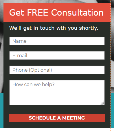
This is the final version of my web form.
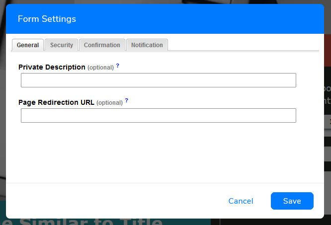
You can also set redirect links, customize the confirmation messages upon successful submission for visitors, set email notifications for the owner, and more under Form Settings.
These are the common settings people will change or activate.
- General > Page Redirection URL – Create a “thank you” page or redirecting people to a specific page within your domain after they have successfully submitted the form
- Security > Form Protection (CAPTCHA) – Activate CAPTCHA to prevent form spam submission
- Confirmation > Custom Page Message -You can choose to add a customized message and show it in the web form area after visitors submit the form, as compared to redirecting them to another place. If you leave it blank, the system will generate a default message.
- Notifications – By default, the system will send out email notifications to website owners upon every web form submission. If you wish to not receive any, you can choose to deactivate them here
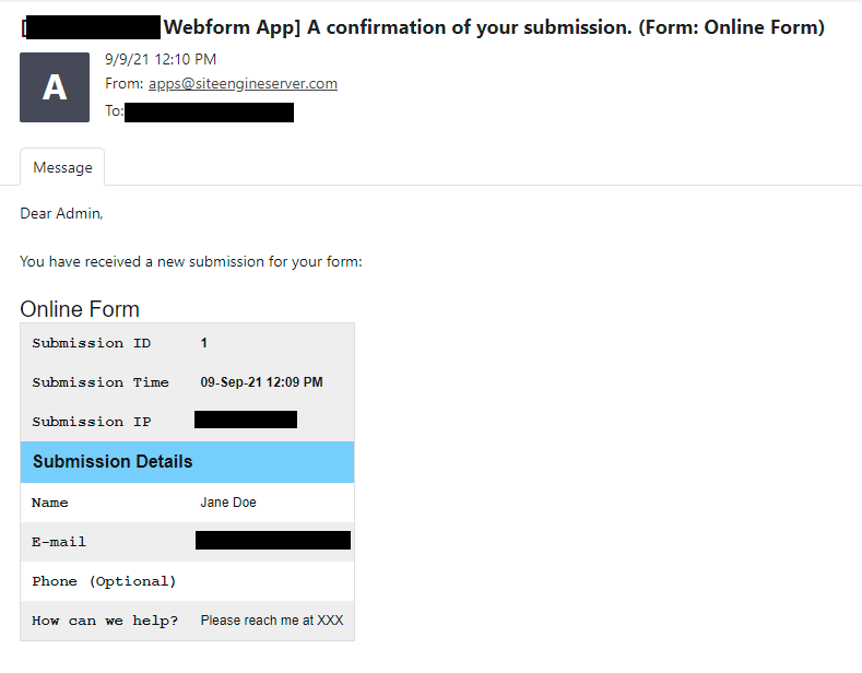
This is a sample of the submission notification, you will receive it as soon as your visitors submit the form.
There are two ways to review your web form data.
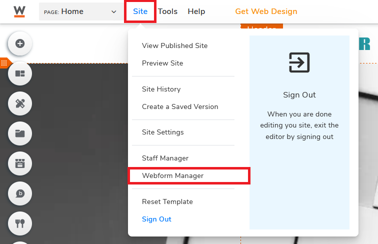
Method one: Go to Site and click on Webform Manager.
If you have more than one web form, choose the web form that you would want to view
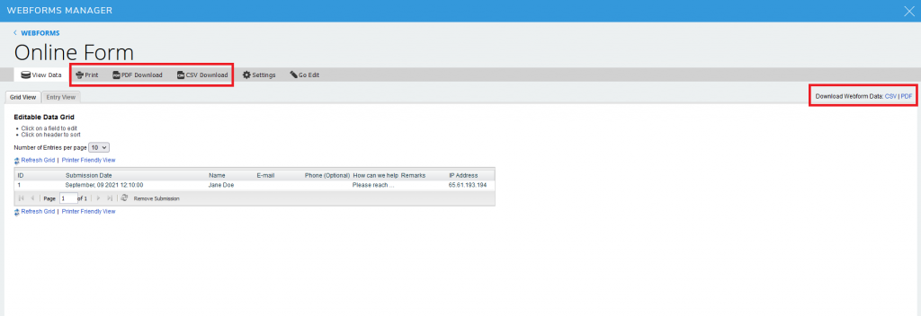
Webform Manager interface
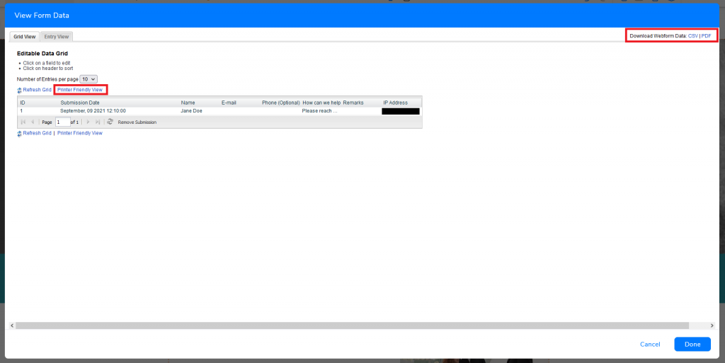
You can also download the data in CSV or PDF format or print it out
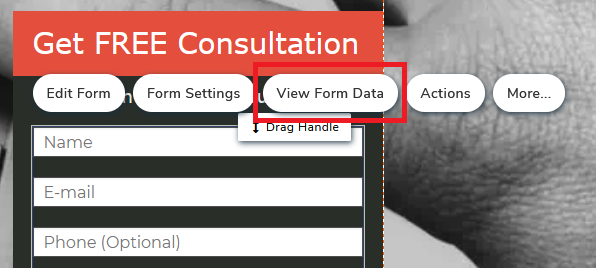
Method two: In the visual website builder, select the web form and click View Form Data.
Similarly, you can view, download and print the data here
Create a Mobile Version Landing Page
We are seeing a steady increase in mobile usage for the past few years. Up till 2021, there are nearly 6.4 billion smartphone users worldwide and we are only expecting to see a further increase to over 7.5 billion in the next five years. According to App Annie, the average time spent on smartphones are roughly over 4 hours per person. More than half of the worldwide website traffic from the first quarter of 2015 to the first quarter of 2021 came from mobile devices. If you don’t have a mobile-friendly website, imagine the number of people you are potentially missing out on.
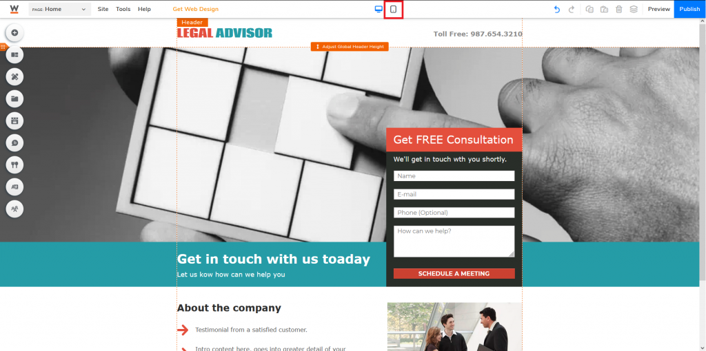
It is very easy to optimize your landing page for mobile devices. Click on the mobile icon at the top middle of your website builder.
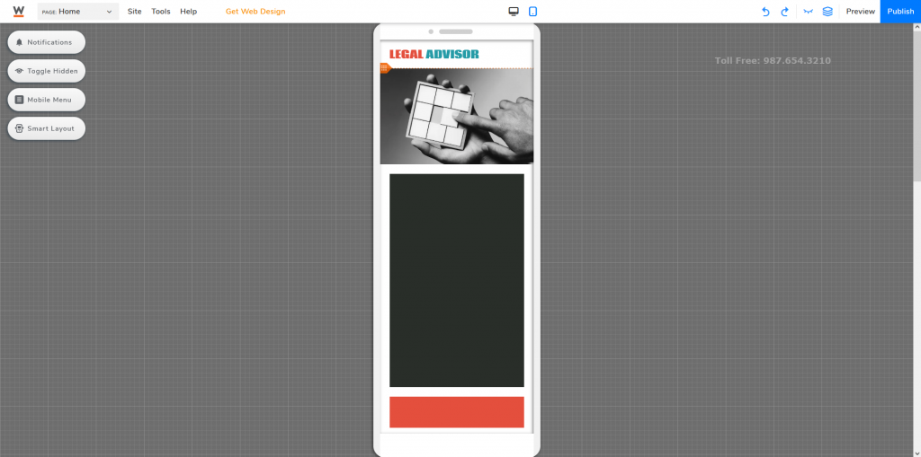
Not all elements will automatically resize to mobile after changing to the Mobile Editor
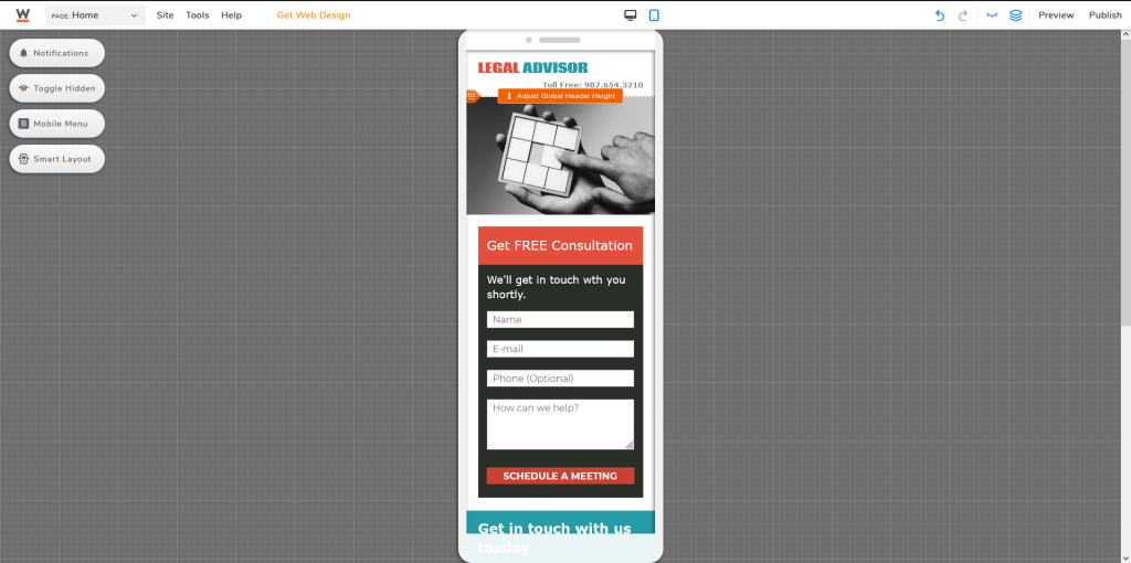
You can try activating Smart Layout, but you might still need to fine-tune the elements one by one to optimize your landing page for mobile.
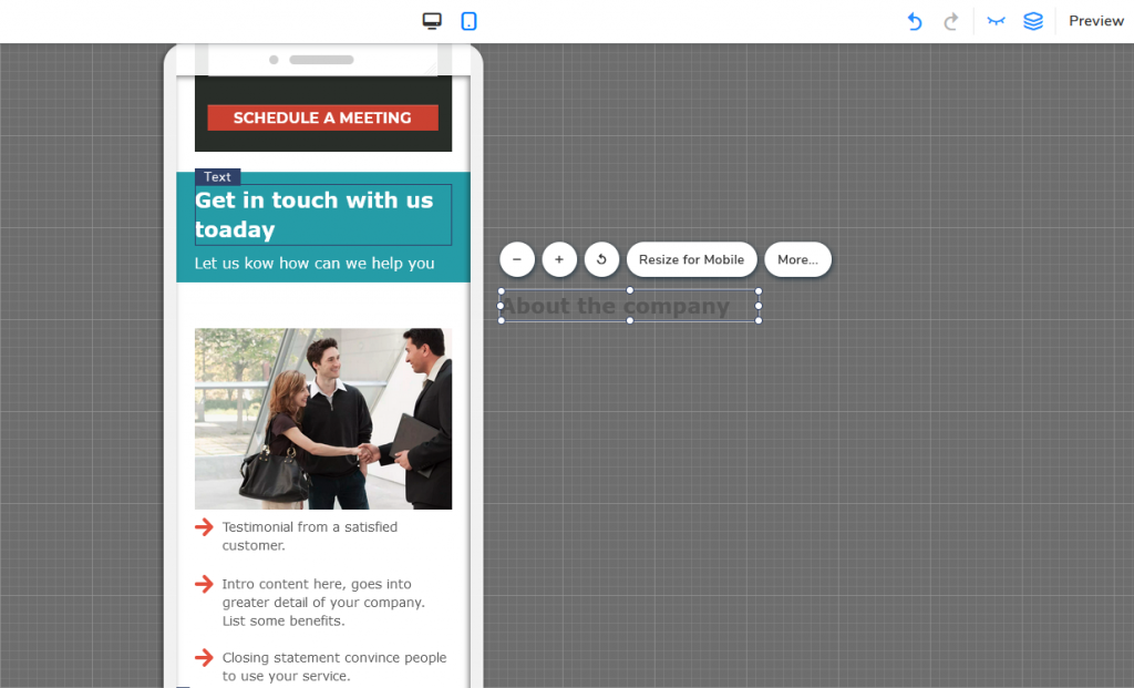
Since mobile screen size is much smaller than computer monitors, you might want to hide certain elements so you won’t be overwhelming your visitors, or simply making it easier to navigate on a small screen by prioritizing elements. To do so, you can either drag it out of frame or click on the specific element and press Hide From Mobile (the closed eye icon).
After fine-tuning everything, your landing page is pretty much ready to go. Just do one last final check, switch back and forth between both Desktop and Mobile editors, and make sure everything is as you wanted it to be. Then just click Publish to launch your landing page.
Landing Page Good Practices
You can create your landing page however you want. That being said, there are a few rules people will follow to maximize its usage.
1. Only provide necessary navigation options
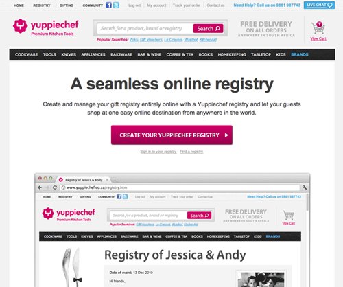
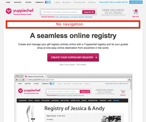
The purpose of using a landing page is to promote a certain product or service. You aim to attract your potential customers, tell them to focus on what you are promoting. You are not creating a page just to distract them with other “good to know” information. The more additional links you provide, the higher chance they will leave your page and never get back to your landing page simply because they got lost between all the navigation. As a result, decreasing your conversion rates or lead generations.
2. Prioritize your content
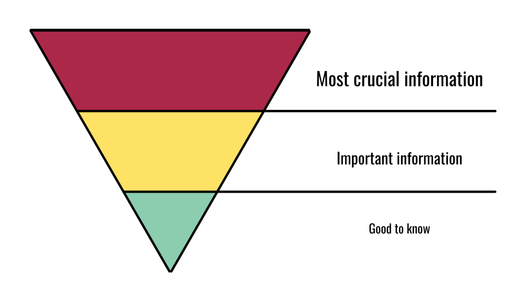
People on average spend 52 seconds or less on a web page. If you have important information buried at the very end, your visitors will likely leave the page before even getting to the end. Use the “inverted pyramid” when structuring your landing page—the most important piece of information at the top (something your visitors can’t miss); followed by supplemental details, and background information at the very end (good to know, but not important enough to affect a person’s decision). While people generally will scroll past the fold, little by little people might be leaving your page as they scroll longer, if you don’t give them a reason to scroll.
3. Focus on what you can offer
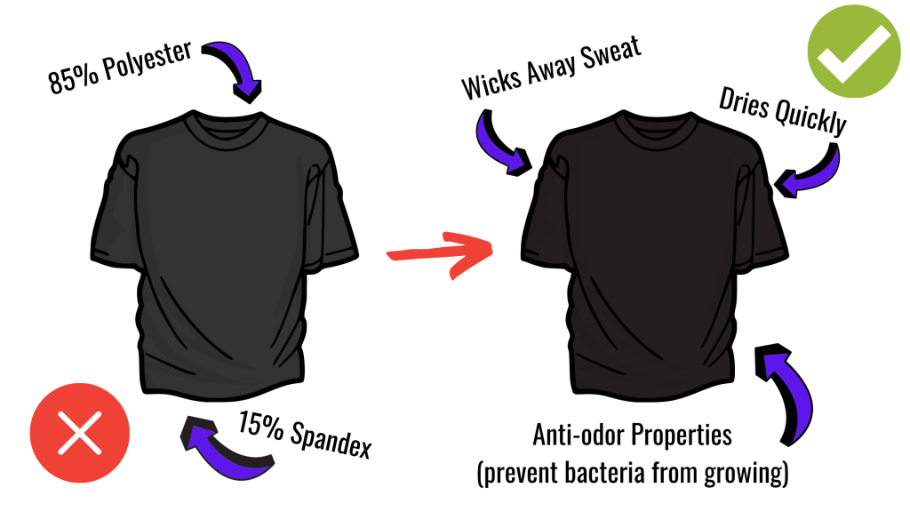
This is a marketing page. Your first goal should be to attract visitors, then give them a reason why they should be interested in your promotion. Don’t just tell them what you have, but tell them what they can get when choosing your product or service.
Tip: Say you are doing a product promotion and would need to provide product details. Rather than putting everything out there on your landing page, you can add a navigation link to the product page to avoid providing too much information and demotivate your potential customers as they start to lose track of what they are reading. Always remember to also limit your navigation options.
4. Keep it clean and simple
What makes a landing page successful? There should only be one goal per promotion, and the number of links attached to your landing page shall reflect the number of goals. This is what we call attention ratio, and ideally, we would want the ratio to be 1:1.
When VWO, a market-leading A/B testing company, conducted an A/B test focusing on conversation rates for one of their clients. They found out that the conversation rate increased by 100% simply by removing the navigation menu on the website.
5. Make your CTA button obvious
Your CTA button is among the most important elements of your landing page, this is how you can generate conversions. Your CTA button should stand out from all other elements. Avoid using generic words/phrases like “submit” or “contact us”, remember, you are telling visitors what to do. For example, replace “Contact Us” with “Get FREE Consultation”, replace “Submit” with “SCHEDULE A MEETING”. According to HubSpot, personalized CTA tends to convert 202% better than default ones generated by the system.
Whether you are aiming to promote products or services, obtain contact information for future marketing purposes, or redirect visitors to a specific page within your website, the purpose of a landing page is to generate leads and persuade your visitors to take action. Rather than having them think and figure out what to do, guide them, tell them what they should be doing.
Now that you know how to create a landing page and how to maximize its usage, it’s now time for you to create one!
