How Much Content Is Too Much?
People are always tempted to put as much content as possible on their websites. This is understandable, we always want to show people that we know our stuff. We want to prove to them that we are trustworthy. The fear of potentially leaving something out is real.
But here’s the thing. If you are putting everything up on a web page, particularly on the homepage, you are risking to push your visitors away from your website.
A good website designer, or even an average joe, should all know that a good website requires a good balance of different elements. This is true for all web pages, particularly for your website’s homepage.
If you have too much text but not visuals, your web page will look dull and people will quickly lose interest. However, if your web page is full-on with visuals but not enough content, your website might not seem professional enough.
What Should You Consider When Designing a Webpage?
Keep crucial information
The majority of your visitors don’t just randomly go to your website without knowing one thing or two. Either someone told them about you or your business, or via search engines when they were searching for something specific. Either way, people would at least know what kind of service or product you are providing, and just want to check out a bit more and potentially your contact info.
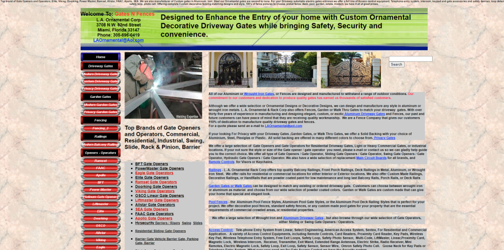
My first reaction when landing on this website, words, words, and words. On top of that, font size 12 px and 14 px with this amount of words? I couldn’t even focus for a minute.
(Source: http://www.gatesnfences.com/)
Tell them what they need to know. If that piece of information is so crucial to a point where it represents who you are, it is the piece of information that determines whether people would go ahead and choose your business. Definitely include that. For others, it depends on how packed your webpage already is.
Keep it clean and simple
Make sure your homepage is clean so visitors can easily navigate through the page and to other pages. If your page looks messy with elements all over the place, people would also just assume you are lazy or careless, therefore didn’t bother to spend some time organizing your website. It wouldn’t give a good impression of your website, and of course, your business.
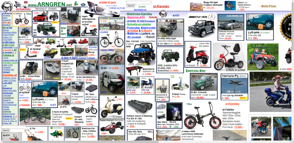
I just couldn’t easily start pinpointing the issue with this website. Confusing typography, random usage of colors, poor placements, no clear business message, not customized for web browser, etc. This is just, honestly, a hot mess.
(Source: https://www.arngren.net/)
On top of that, most people only get that much attention span when browsing online. This is not a book, not a magazine, nor a newspaper. People usually continue browsing a website only if they find it interesting. (Unless your website is so famous to a point where its fame outweighs everything else.)
Include visual content
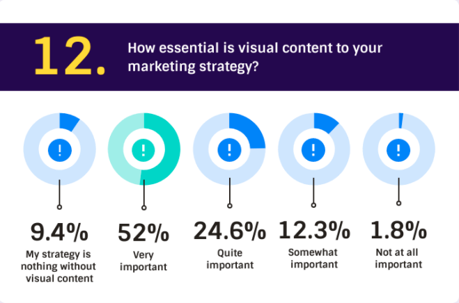
Some content works well with written text, while some others work better with images. In fact, according to Venngage, more than half of marketers surveyed see visual content as an essential part of their 2021 marketing strategy.
Source: Venngage
There are a few benefits for using visual content:
- People tend to digest visual content quicker and better than text
- It stimulates audience engagement
- It gives visitors something to remember
- Visitors are likely to stay longer, compared to a boring text-majority web page
Organization and Placement
Keeping crucial information and keeping a web page simple and clean doesn’t mean sacrificing valuable information. This is about knowing what is important that needs to go in the front, and what could be saved for later—to be mentioned on another page.
Each web page serves its own purpose. Blog posts are where you share ideas and demonstrate your expertise. An about page is where you introduce who you are, how your business came about, your vision, and your mission. Contact page is now people could reach out to you. And a homepage is like a magazine cover, attracting people’s attention and giving them a sneak peek of your website.
Imagine writing a long research paper, you will likely use headings and subheadings to divide your paper into different parts. Incorporate that idea into your website building process, place these headings and subheadings on your homepage and others on other web pages. Just, slightly tweak the tone and make it persuasive.
Is There Such A Thing As “Too Much Content”?
Well, it depends on the context of this question. This is, in my own opinion, a misleading question.
Is there such a thing as “too much content”? Not really, people are always craving for more.
However, if you ask me, is there such a thing as “too much content” for a web page or an article? Potentially, not everyone prefers to read, read, and read non-stop.
Every website serving different target audience groups will have completely different design and language aspects. However, the general principle is still the same—never overwhelm your visitors. The worse thing is to throw them a bunch of content on one page, they are likely to just abandon your website.
It is challenging, but the key here is to strike the balance between “too much” and “just right”. To give “just enough” content that interests your visitors, and invite them to continue exploring your website.
Take a look at your website’s homepage and ask yourself. Is there too much content? Can you easily focus on what’s on the page? Did you, at any moment, get the urge to leave the web page? If your answer is yes to either one question, you might want to consider redesigning your web page again.
Don’t have a website? Try out Website.com’s website builder. It is easy to use and free for the most part. I’ve previously written about their website builder and how you could build a website using their platform. But if you have some coding knowledge and are on for a challenge, feel free to use content management systems such as WordPress.


