How to Build A Website
Step-by-Step Guides & Tips Specifically Made For Beginners
First, welcome to this website!
I’m a researcher and writer who stepped into this website-building world 3 years ago. With this guide, I aim to help all of you—especially beginners—to easily build your website!
Believe it or not. You don’t need to know how to code (I don’t!) or spend big to creating a professional website. All you need is a little creativity, good content, and the motivation to succeed.
A Free Resource to Help You Get Started
Create Your Website

Expand Your Reach

Grow Your Website
How to Build Your Own Website?
Step-by-Step Guide for building a website
Have you ever thought of owning a website or wondered if you need one? Just simply ask yourself a few simple questions:
1. Are you a freelancer or individual talent trying to showcase your work and skills to clients?
2. Are you a business owner who wants to expand your customer base and extend business to people all over the world?
3. Or even, are you a person who simply wants to share your hobbies or stories with others?
If you fit into one of these categories, having a website will benefit you a lot.
CMS platforms like WordPress genuinely have a steeper learning curve that might not be suitable for everyone. That being said, if you’re on the more experienced side, or if you’d like to take on a challenge and use WordPress to build your website, you’d be looking for a web hosting service company to host your WordPress website. I would personally recommend choosing Doteasy, a WordPress hosting service provider which offers WordPress pre-installation service once a user chooses a plan. They also provide a WordPress auto-update service so you’ll will always be using the latest version of the CMS platform. Along with being a certified green web host, that is, a web hosting that uses renewable eco-friendly energy to power their services, I notice they’re offering deals on their web hosting plans that look to me like great value for anyone wanting to host a site. Consider these plans if you’re looking for a reliable and value-packed hosting provider.
One point I’d like to highlight about Doteasy is their in-house customer support team, which comes in handy particularly when using content management systems (CMS) like WordPress. Due to the nature of WordPress requiring constant updates, there were multiple occasions where I had come across different technical issues such as sudden display changes to my website. It could be related to a sudden WordPress system update resulting in a coding conflict between my theme or plugins and the system, or there simply weren’t any available theme and/or plugin updates to accommodate the changes in WordPress. I know, it sounds confusing because it is. After several failed attempts, I’d decided to reach out to the Doteasy customer support team, finally resolving the issue by using a set of CSS codes provided by their in-house WordPress expert and web developers.
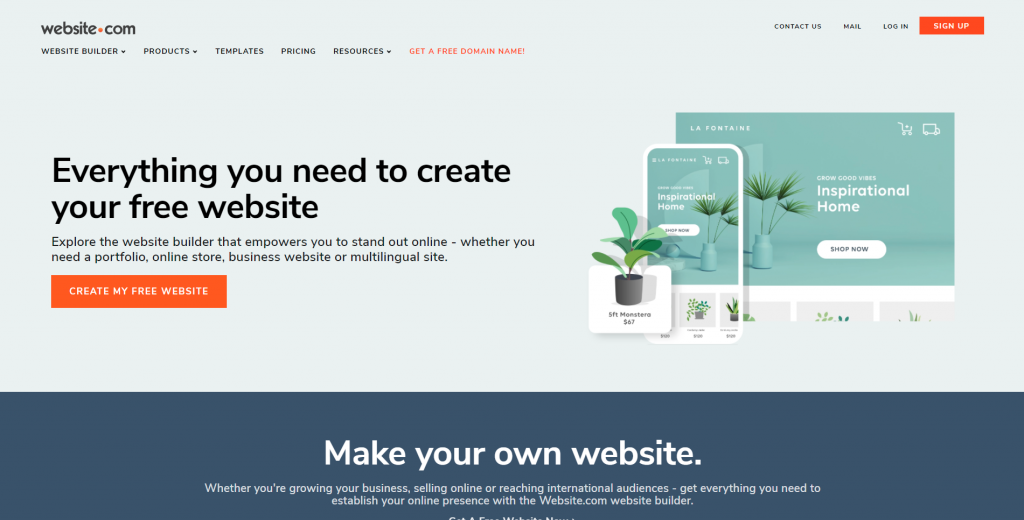
As a non-techie person with next to zero coding knowledge, I’d soon decided that WordPress might not be a suitable platform for me in the long run, and started searching for alternatives — website builders. After trying out all these website building platforms, I’m happy to recommend Website.com, especially for beginners. It’s a simple drag-and-drop website builder with hundreds of templates available to jumpstart your website building process.
The Benefits of Using Website.com’s Website Builder For Beginners
-
Offers free plan
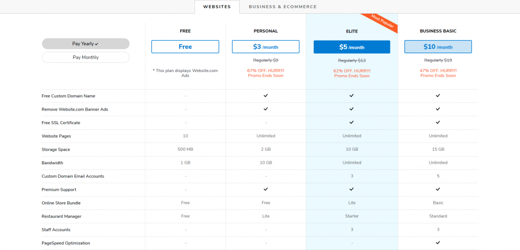
Many website building platforms provide free plans with very limited functions, or free trials for users to experience the full services of a website builder for a limited time period, usually for 14 days. Website.com’s free plan already gives users access to essential functions for creating a website. Users have the freedom to stick with the free plan as long as they want, or upgrade their plan to increase functionality and add different features to their website when needed.
-
Hassle-free of security updates
Many free website building platforms such as WordPress and Joomla are built with open-source scripts, meaning users will need to perform their own security updates on a regular basis. With website builders like Website.com, which are typically not an open-source website building platform, Website.com developers are the ones who will be taking care of all the security updates.
-
Easy to use
No downloads or installations are needed when creating your website using Website.com’s website builder. All you need to do is go to Website.com, log into your account, and everything you need will be available online. You don’t even need any File Transfer Protocol (FTP) upload program to upload and publish your content.
On this page, I’ll walk you through the process to create a website using the website builder from Website.com.
Step One – Create An Account
The first thing you need to do is register an account with Website.com.
Website.com offers free and paid plans. You can go ahead and sign up with their free plan to get started with building your website. Once you’re happy with your design, you can later choose to upgrade to a paid plan which includes a free custom domain name.
Next, Choose Your FREE Custom Domain
Having a great domain name is essential to your website, since it represents who you are and/or what your business is about, both online and offline. As a general rule of thumb, you’d want to keep it short, simple, and predictable.
I’ve written another article specifically about domain names, but here are some general tips when it comes to choosing your domain name.
- Business site – CompanyName.com
- Personal site – FirstNameLastName.com, NameProfession.com, NameHobby.com
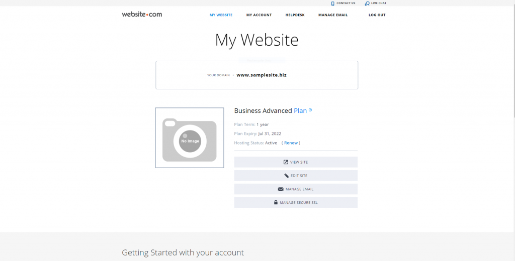
For this demonstration, I’ve chosen a paid plan and samplesite.biz as my domain name.
Tips on choosing your domain name
Stick with .com
While there are tons of new domain extensions such as .co, .ai, .app, .io., relatively traditional extensions like .com, .net, .org are still the most popular and common ones. I’ll always recommend sticking with the .com domain extension. Not only is it the most common one, it also looks credible and professional. But most importantly, this is usually the first thing that will come into people’s minds when typing domain names.
Note: If you’re a small business or your intended audience is in a particular location, you can also opt to use country-specific extensions like .us, .co.uk, .ca, etc. Check out Doteasy to better understand the different kinds of potential domain extensions you can use. And hopefully, that could give you some inspiration when you are creating your own domain name.
Keep the domain name short
Google typically suggests using 3 to 4 terms for your domain name. The key is to keep your domain name short and memorable. The longer it is, the higher chance your visitors might not get your domain right, either when they’re trying to type it out or remember it to come back in the future.
Make sure your domain name is easy to spell
Make sure your domain is easy to spell and pronounce. If you have to explain and spell it out more than once, consider simplifying or changing it.
Choose A Template to Customize!
After setting up your account, click Edit Site to start building your website.
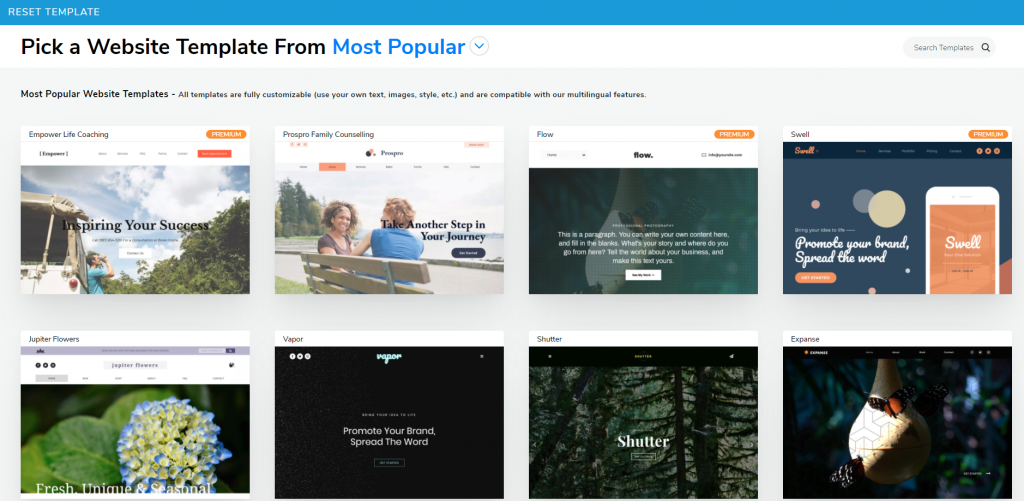
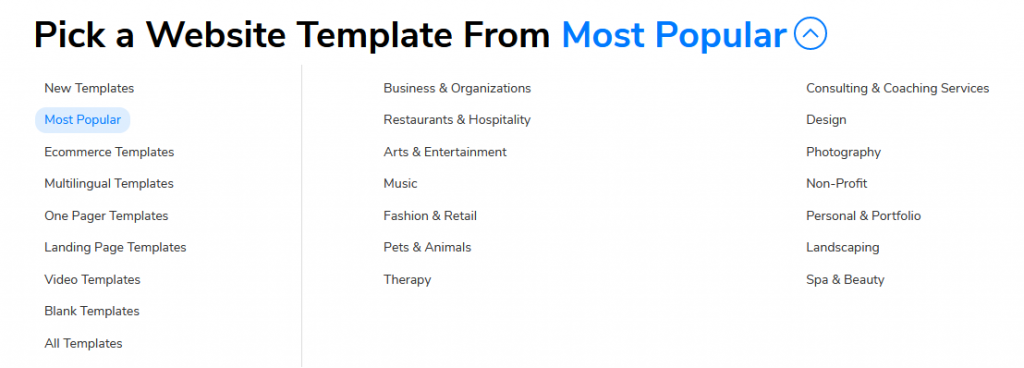
The first thing you will come across will be the Website Template page. Here you can choose a design that best fits your purpose. There are over 500 website templates on Website.com, each built for specific purposes (portfolio website, accountant website, landing page, home inspector website, etc.). All templates are pre-built with elements such as fonts and colors, and placeholder texts/images.
Even if you can’t find one that entirely fits your needs, such as if the images shown don’t feel relevant to who you are or what you can provide, you can always replace the text and images later to further customize it.
As a side note, you definitely have the option to build your website from scratch. However, unless you have extensive experience in building one, I would strongly suggest you stick with one of the templates and customize it.
One Page or Multi-page
Another thing to keep in mind when choosing a template is whether you will want to create an all-in-one one-page website, or separate your content into different pages. The key difference here is how you’ll want your visitors to navigate through different content on your website by clicking the navigation bar (also known as the menu bar). I will give more details on how to build a one page or multi-pages website in a bit.
You can always preview the template before choosing one.
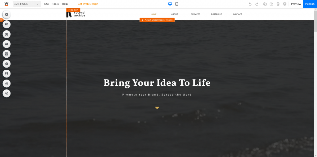
Once you are set with a design, click Select and it will bring you to the Website Builder.
Add Your Own Website Content
Before making any changes to the design or the layout of your webpage, you’ll need to first provide some content on your website.
In general, there are typically 3 must-have elements on your web page(s):
-
Homepage
Your homepage might be more important than you ever could’ve imagined. This is very likely the very first page your visitors will come across. It should make a good and strong impression, quickly giving your visitors an idea of what this website is about.
-
About Me
This is where you can introduce yourself, your website, or if you’re a business owner, introduce your store and your products/services to your potential customers.
-
Contact Me
If people are interested and want to connect with you, this is where people will go to find and contact you. Some common information that you should provide includes your email, phone number, and/or address (if you have a physical store).
There are great benefits using pre-built templates to build your website. You can make use of all existing fonts and colors handpicked by professional web designers. Existing placeholder text and images show you the layout of the chosen template, and from here, you can change and replace the placeholder text and images to suit your own needs. If you are unclear about which font the template is using, you can simply Copy & Paste the text and paragraphs to keep the style consistent.
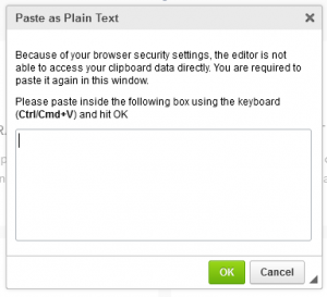
Tip: If you tend to copy your content from elsewhere (e.g. Google documents) and paste it to the website builder, a simple copy & paste will generally work, without changing the preset design (such as the font and size). In case it changes, you can also right click your mouse and select Paste as Plain Text.
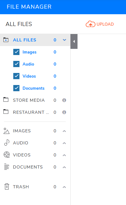
To add image and video files to your website, click Add Elements and choose either Image or Audio & Video to add your content to the page. It will bring you to the File Manager interface so you can upload the files to the site.
Note: There will be a storage limit for your site’s content depending on your chosen plan. The simplest way to increase your storage is to upgrade your plan.
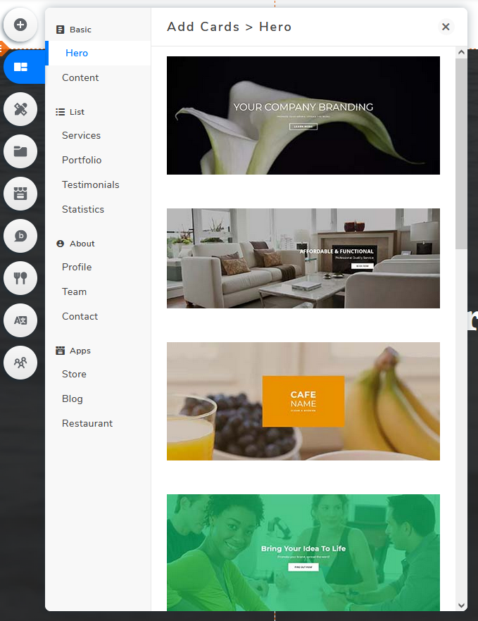
Other than customizing the already made content from the template, you can also add additional content by clicking Add Elements or Add Cards.
Add Elements
Add Cards
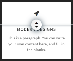
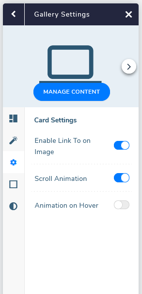
Tip: I strongly suggest using the Add Cards option so you can make use of the already built-in functions such as adjusting the proportion of elements and animation.
Add Proportions
Animations
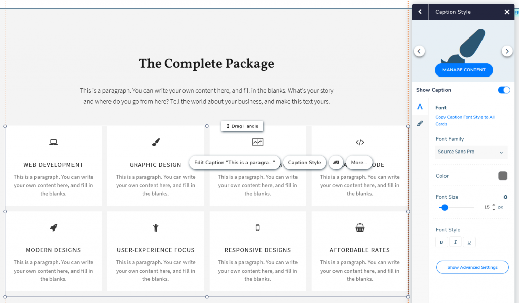
Tip: To apply the changes to all elements under the same card, simply click Copy Font/Image/Icon Style to All Cards to apply the same changes.
How to Organize Web Pages
One Page Website
A one page website is simply a website with all information shown on the same page. Visitors can quickly navigate to different sections of the page without switching and reloading a brand new page.
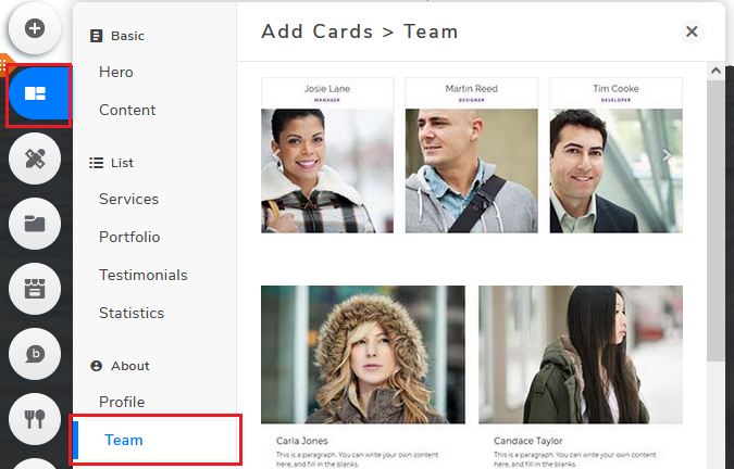
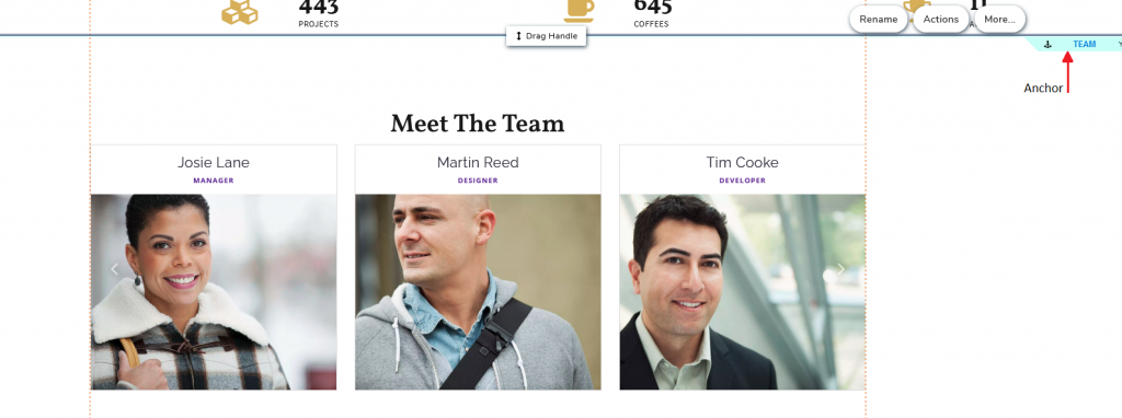
For this example, I have added a “Meet The Team” section:
Add Cards > Team
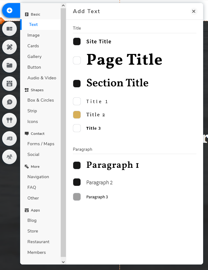
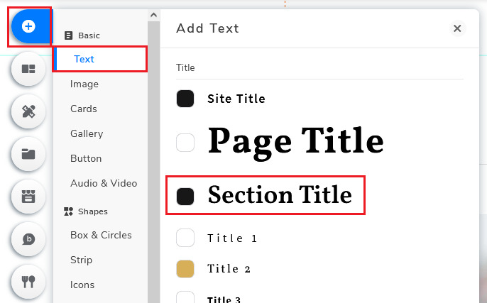
Add Elements > Add Text
Title > Section Title > “Meet The Team”
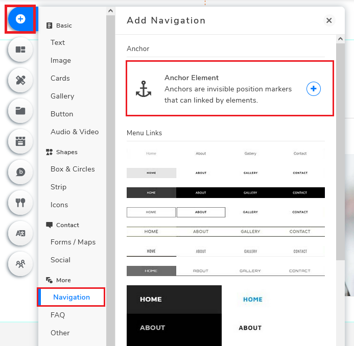
In order to allow visitors to quickly navigate to the “Meet The Team” section by using the menu bar, I will first need to create an anchor. Go back to Add Elements again, this time click Navigation and click Anchor Element.
Add Elements > Navigation > Anchor Element
Drag to “Meet The Team” > Rename “TEAM”
Drag the Anchor to where you want your section to start and rename it..
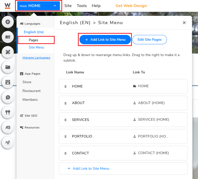
Next, you’ll need to create a link in the menu bar.
Go to the top left corner and click on the Page button (right next to the Website.com logo).
Under Site Menu, click Add Link to Site Menu.
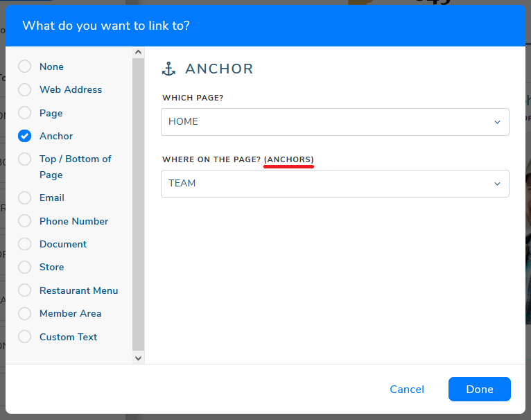
Select Anchor to create an anchor link.
Choose the page (in this case the homepage) and how you will want the link to respond.
(Here, you’re basically deciding where your visitor will “jump to” in the page after clicking the link on the menu bar.)
Note: The “Anchors” is the Anchor Element that you’ve created
Multi-page Website
Multi-page sites consist of multiple pages and sub-pages. These websites typically allow you to provide more detailed content to your visitors.
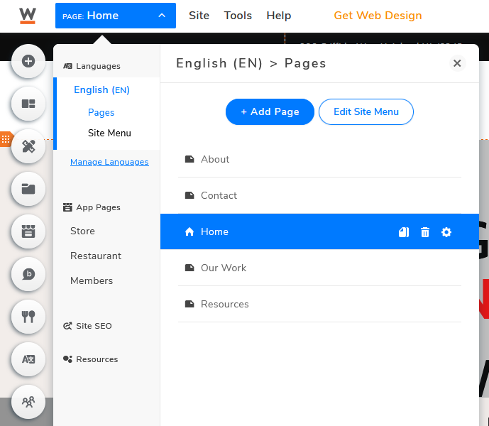
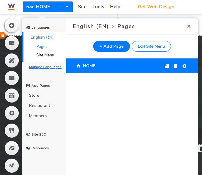
The first thing you will notice is that when you click the Page button, you will see multiple “items” under pages, rather than just one single “item” when using one page templates.
Multi-page template
One page template
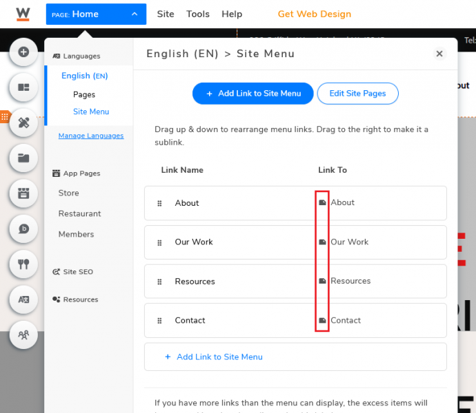
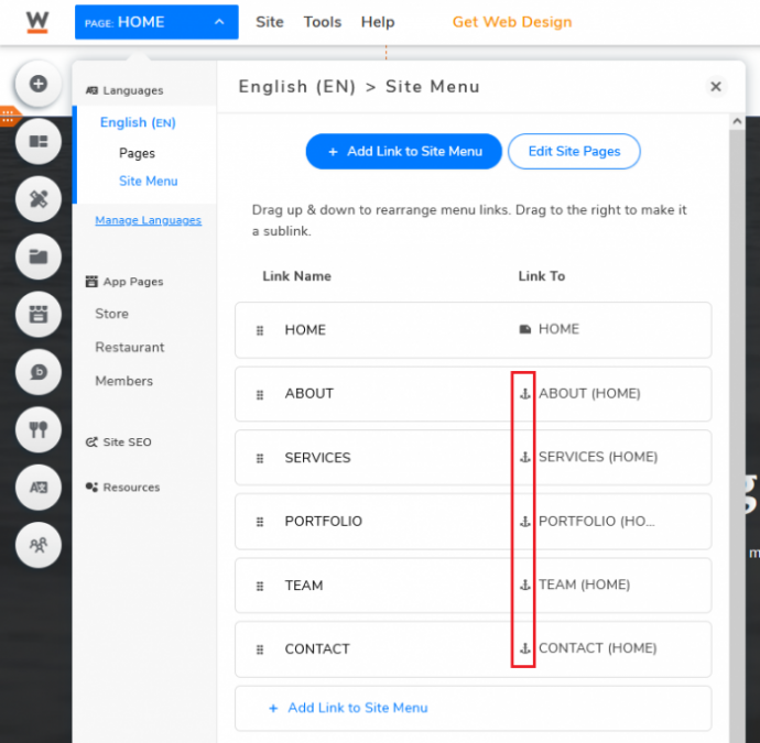
Under Site Menu, links will be linked to separate pages rather than anchors.
(Multi-Page) Links – Pages
(One-page) Links – Anchor
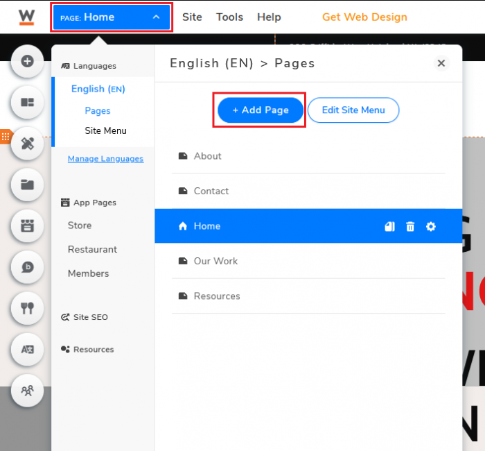
To add pages, go to the top left corner and click on the Page button (right next to Website.com’s logo). Under Page, click Add Page.
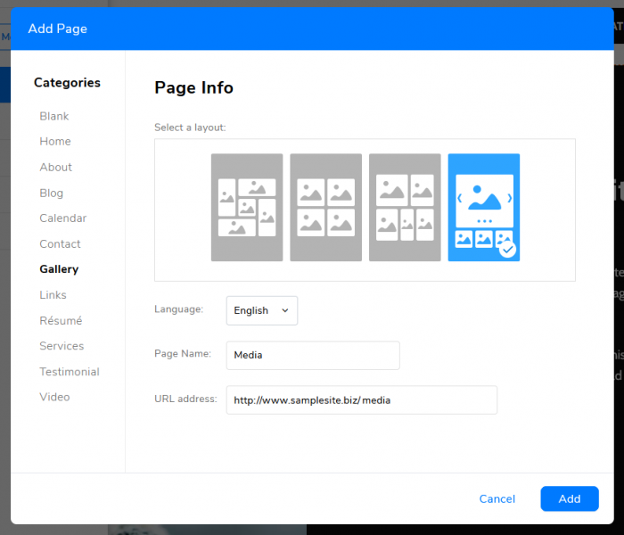
Depending on what you need, you can choose to create from scratch (Blank) or choose one of the templates.
Once you’ve selected your page of choice, click Add, your site menu will also be updated automatically.
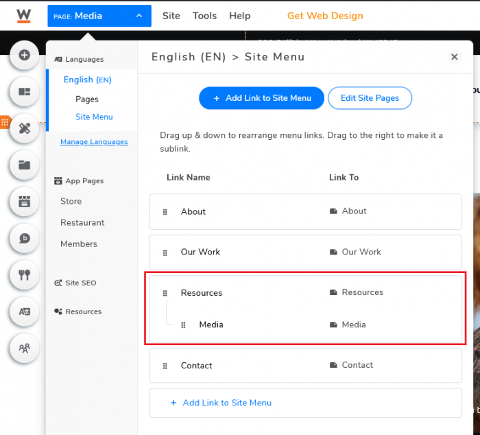
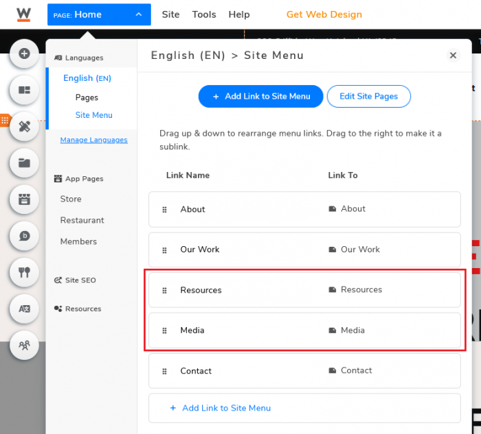
If you want to make it a sub-page, simply go to Site Menu and drag the page to your desired location, slightly to the right.
Menu Bar (sub-page)
Menu Bar (separate page)
Multi-page template example: Ashcroft Women’s Society
Create Your Mobile Version
Increasing numbers of people are surfing the web and consuming media on their smartphone. There are 3.8 billion smartphone users in today’s world, which is roughly 48% of the world’s total population. According to digital marketing agency Wolfgang, over 70% of website traffic is now mobile. Having a mobile-friendly website is no longer something that’s “just nice to have,” it’s a necessity. If your website is not mobile-friendly, it makes it very difficult for your visitors to navigate your website on a small screen.
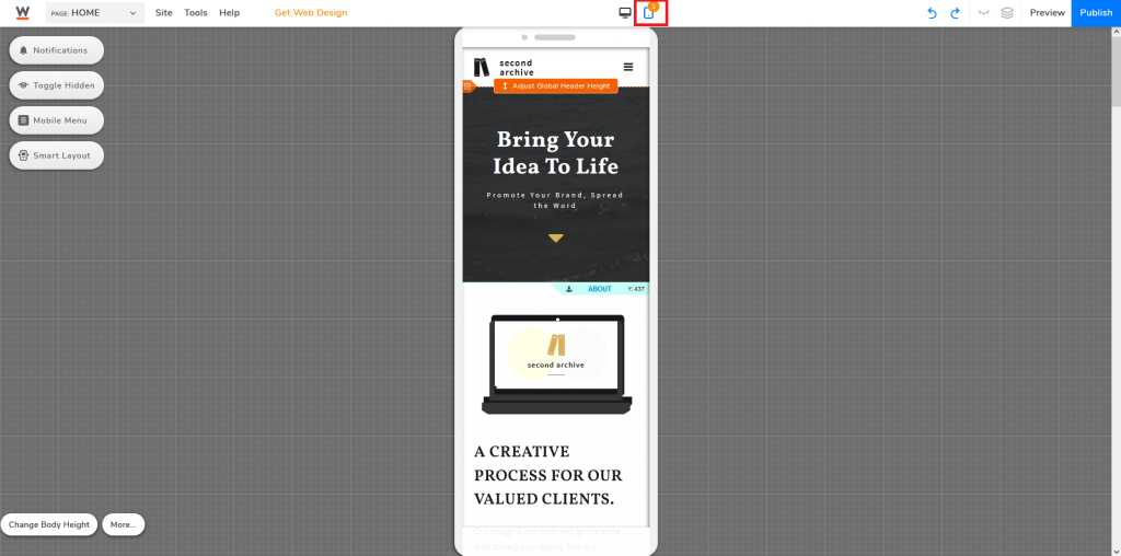
On Website.com’s website builder, click the Mobile button at the top middle of the website builder and you can start optimizing your website for mobile.
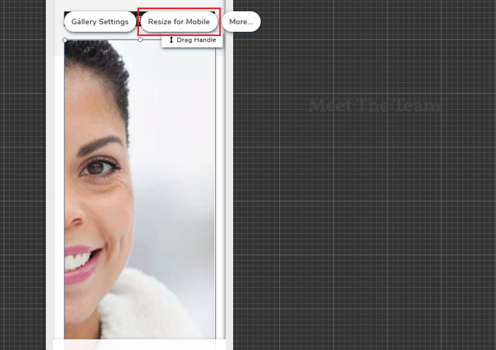
In case some of your content is out of frame or not compatible with the mobile screen, choose the specific element and click Resize for Mobile. You may need to fine-tune the elements for a nicer design.
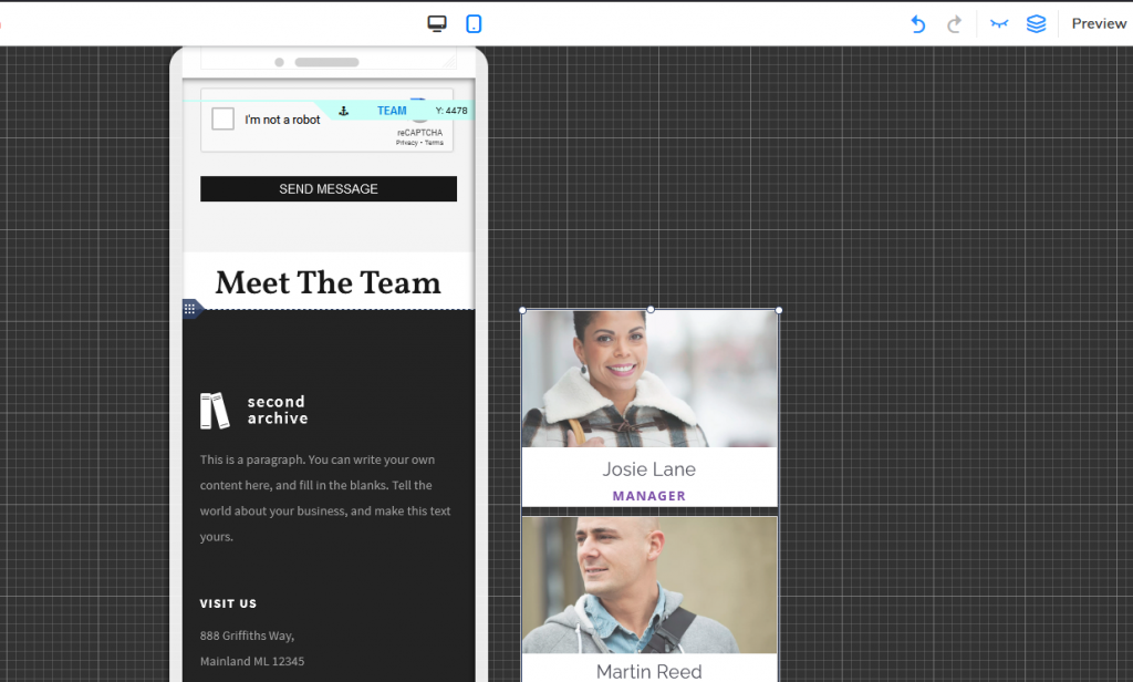
You also have the option to simply hide certain elements on mobile. To do so, drag the element outside of the frame or select the element and click Hide From Mobile (Note: This feature is only available for mobile sites).
Publish Your Content
Once you’ve finished building your website, remember to click Publish in the upper-right.
Remember that whenever you make any changes in the future, changes will only go live when you click publish again.
Now you’re done! Congratulations and welcome to your new website!
Building a website can definitely sound intimidating at first. Even with a step-by-step guide helping you build your website, there’s still a lot of room for all kinds of customizations to build your “ideal website”.
Building a great website is a process that takes time, and some might compare it to being like a marathon. But with the abundant resources available online, you can definitely find a suitable solution that suits your level of advancement and needs. Now that you’ve launched your website, it’s time to add different elements and get your content noticed by others!
